Autobox Blog

Thoughts, ideas and detailed information on Forecasting.

  • Home
    Home This is where you can find all the blog posts throughout the site.
  • Categories
    Categories Displays a list of categories from this blog.
  • Tags
    Tags Displays a list of tags that has been used in the blog.
  • Bloggers
    Bloggers Search for your favorite blogger from this site.
Recent blog posts

Dell acquired Statistica in 2014 and did what was called  a "major overhaul" and now through the magic of Gartner pixie dust is in the Magic Quadrant for Advanced analytics. Woohoo. Tibco bought it from Dell in 2016.  We stumbled upon an example in the Statistica documentation that we benchmarked against Autobox. The differences we saw were dramatic and common to what we see vs. the competition.  By logic, if Statistica is in the Magic Quadrant then we should be the undisputed heavyweight champ of the world.  Now, the major overhaul was based around the interface and "in-database" connectivity so the analytics didn't get the new coat of fresh paint.  Try this example that we have below in your tool to see if yours works or not.

You can download a 30 day trial of Statistics here.

You can download the Autobox output here(and ASC/data file to run with) or try yourself with our 30 day trial.

The example is meant to show how to model time series data when an Interruption" has occurred.  The data used was from the McLeary/Hay text book on phone calls to directory assistance per month in Cinncinati.  A charge for a call began at period 147 so a level shift variable was being tested to model the impact.  Statistica identifies a -399 impact with a bad forecast while Autobox identifies an impact of -533 and a good forecast. The thing that makes this example disturbing is that Statistica is not an automated tool. The person running the analysis decided to only analyze the data before the interruption and use only the first 146 observations of the 180 to determine if seasonal differencing should be applied. Time series isn't done in a piecemeal fashion. The model that is built is then inappropriately applied using the entire 180 observations along with a level shift (ie interrupted) variable to measure the impact in policy. Bad. Bad. Bad. or is that that person didn't know that they should be looking for outliers and level shifts like Autobox?

We did contact the creators of Statistica and the response was "Our users would be upset if the answer was different than the book".  That was shocking to hear.  So, you never want to learn or change methodology to something better?


The upcoming interview with David Hendry to be published soon in the International Journal of Forecasting reveals a researcher whose work is top tier.  One of his accomplishments discussed was his methodology of detecting change in parameters (ie Chow test) and outliers called "Impulse Indicator Saturation"(ISAT) which is available in the R GETS Package.  We tested it out and weren't impressed compared to what Autobox does on some examples.  Of course, we are always ready to listen, if you have any opinions on this matter.  Speak up, we'll listen!

Detecting change in patterns is not only very important for forecasting, but also for what some advertise as "Business Intelligence" where you want to detect unusual behavior in the data. So, who can detect this?

There are two examples used in the package.  One is the Nile example(Cobb 1978) and the other a random number generator creating a counter example to show that it doesn't create false positives. The Nile example is well handled as it is in Autobox(comes with Autobox in the \course\Example2.asc folder).

ISAT finds the level shift and the outlier at obs 43, but misses the others that Autobox finds at 7,18,94.


ISAT handles the two examples well enough.  However, when we gave it one of our favorite and very OBVIOUS examples that we use to demonstrate changes in parameters it didn't detect the change.  We wonder "Why?".  Please tell us if you know. :)

The data is 9 years of quarterly GDP with a obvious break in parameters. The following output can be easily reproduced by downloading Autobox and run using the example found in Autobox in the \course\Example16.asc. folder.

Here is the data if you want immediate access to it to try in your tool(we'd love to hear what  your tool does with this!). 130.7,137.7,137.7,161.2,173.3,181.1,181.5,180.7,180.7,193,207.8,209.5,211.6,228.4,237.1,233.5,243.1,280.2,297.1,328.2,283.3,330.7,348.9,385.8,326,381.9,395.6,429.1,350.8,406.5,422.2,470,387.3,441.6,453.7,494.1


Here we run the GETS ISAT function


Here are the results of ISAT from the GETS Package. The fit shows that it is not detecting the seasonality and it thinks there are 4 changes???  It doesn't detect the change in parameters(onset of seasonality) and model it.  Why?


Autobox identifies a break point an tells the user


Here is the model showing an AR4 with a constant and the detection and deletion of the older data using only data after the break.


Here is the actual, fit and forecast of the truncated series.


Alteryx is using the free "forecast" package in R. This BLOG is really more about the R forecast package then it is Alteryx, but since this is what they are offering.....

In their example on forecasting(they don't provide the data with Alteryx that they review, but you can request it---we did!), they have a video tutorial on analyzing monthly housing starts.

While this is only one example(we have done many!!).  They use over 20 years of data.  Kind of unnecessary to use that much data as patterns and models do change over time, but it only highlights a powerful feature of Autobox to protect you from this potential issue.  We will discuss down below the use of the Chow test.

With 299 observations they determine of two alternative models (ie ETS and ARIMA)which the best model using the last 12 making a total of 311 observations used in the example. The video says they use 301 observations, but that is just a slight mistake.  It should be noted that Autobox doesn't ever withhold data as it has adaptive techniques which USE all of the data to detect changes.  It also doesn't fit models to data, but provides "a best answer".  Combinations of forecasts never consider outliers.  We do.

The MAPE for ARIMA was 5.17 and ETS was 5.65 which is shown in the video.  When running this in Autobox using the automatic mode, it had a 3.85 MAPE(go to the bottom). That's a big difference by improving accuracy by >25%.  Here is the model output and data file to reproduce this in Autobox.

Autobox is unique in that it checks if the model changes over time using the Chow test.  A break was identified at period 180 and the older data will be deleted.

      DIAGNOSTIC CHECK #4: THE CHOW PARAMETER CONSTANCY TEST
             The Critical value used for this test :     .01
             The minimum group or interval size was:     119

                    F TEST TO VERIFY CONSTANCY OF PARAMETERS                    
                                                                                
           CANDIDATE BREAKPOINT       F VALUE          P VALUE                  
                                                                                
               120 1999/ 12           4.55639          .0039929423              
               132 2000/ 12           7.41461          .0000906435              
               144 2001/ 12           8.56839          .0000199732              
               156 2002/ 12           9.32945          .0000074149              
               168 2003/ 12           7.55716          .0000751465              
               180 2004/ 12           9.19764          .0000087995*             

* INDICATES THE MOST RECENT SIGNIFICANT  BREAK POINT:    1% SIGNIFICANCE LEVEL. 

  IMPLEMENTING THE BREAKPOINT AT TIME PERIOD    180: 2004/   12 

  THUS WE WILL DROP (DELETE) THE FIRST   179 OBSOLETE OBSERVATIONS
  AND ANALYZE THE MOST RECENT   120 STATISTICALLY HOMOGENOUS OBSERVATIONS


DIAGNOSTIC CHECK #4: THE CHOW PARAMETER CONSTANCY TEST The Critical value used for this test : .01 The minimum group or interval size was: 119 F TEST TO VERIFY CONSTANCY OF PARAMETERS CANDIDATE BREAKPOINT F VALUE P VALUE 120 1999/ 12 4.55639 .0039929423 132 2000/ 12 7.41461 .0000906435 144 2001/ 12 8.56839 .0000199732 156 2002/ 12 9.32945 .0000074149 168 2003/ 12 7.55716 .0000751465 180 2004/ 12 9.19764 .0000087995* * INDICATES THE MOST RECENT SIGNIFICANT BREAK POINT: 1% SIGNIFICANCE LEVEL.

The model built using the more recent data had seasonal and regular differencing, an AR1 and a weak AR12.  Two outliers were found at period 225(9/08) and 247(7/10).  If you look at September's they are typically low, but not in 2008. July's are usually high, but not in 2010.  If you don't identify and adjust for these outliers then you can never achieve a better model.  Here is the Autobox model                                                                                                               

[(1-B**1)][(1-B**12)]Y(T) =                                                                                   
         +[X1(T)][(1-B**1)][(1-B**12)][(-  831.26    )]       :PULSE          2010/  7   247
         +[X2(T)][(1-B**1)][(1-B**12)][(+  613.63    )]       :PULSE          2008/  9   225
        +     [(1+  .302B** 1)(1+  .359B** 12)]**-1  [A(T)]

Alteryx ends up using an extremely convoluted model.  An ARIMA(2,0,2)(0,1,2)[12] with no outliers. That is a whopping 6 parameters vs Autobox's 2 parameters.

Let's take a look at the residuals. It tells everything you need to know.  Period 200 to 235 the model is overfitting the data causing there to be a large are mismodeled. Remember that Autobox found a break at period 180 which is close to period 200. The high negative error(low residual) is the July 2010 outlier that Autobox identifies.  If you ignore outliers they play havoc with your model.


Here is the table for forecasts for the 12 withheld periods.


Posted by on in Forecasting

This graph is from a client and while it is only one series, it is so illustrative. The lesson here is to model and not fit. There might not be strong enough seasonality to identify it when you only have a few months that are seasonal, unless you are LOOKING for exactly that.  Hint: The residuals are gold to be mined.

This will be our shortest BLOG ever, but perhaps the most compelling? Green is FPro.  Red is Autobox. Actuals are in Blue.

SAP HANA is a Database.  PAL is SAP's modeling tool.  SAP's naming conventions are a bit confusing.  SAP HANA has a very comprehensive user's guide that not only shows an example model of their "Auto Seasonal ARIMA" model on page 349, but also includes the data which allows us to benchmark against.  The bottom line is that the ARIMA model shown is highly overparameterized, ignores outliers, changes in level and a change in the seasonality.

Here is the model built by HANA that we took and estimated in Autobox which matches what SAP shows in their User's guide. We suppressed the identification of outliers, etc. in order to match.  None were searched for and identified by SAP.  Maybe they don't do this for time series??  We can't tell, but they didn't present any so we can assume they didn't.  That's a lot of seasonal factors.  Count them....1,2,3,4. That's a red flag of a system that is struggling to model the data.  We have never seen two MA4's in a model built by Autobox.


With that said, the truth is the forecast from Autobox and SAP HANA is about identical when using all 264 observations. However, you need to consider other origins.  If you go back 7 periods and use 257 observations (and assume the same model which I feel safe doing for this example) to where there were back to back outliers the forecast isn't good.  The forecast(as expected) using 256,258,259,260 observations is also bad so yes you want to adjust for outliers and there are consequences if you don't.  To reproduce all of this in Autobox, run with Option "4" with this Autobox file, model file and rules.


Here is the forecast using Autobox using all the data(SAP HANA is just about the same)

The example is quarterly data for 264 periods.   What SAP HANA doesn't recognize(likely others too?) is that with large samples the standard error is biased to providing false positives to suggest adding variables to the model.  When this occurs, you have "injected structure" into the process and created a Type 2 error where you have falsely concluded significance when there was none.

The example is a fun one in a couple of ways.  The first observation is an outlier.  We had seen other tools forecast CHANGE adversely when you deliberately change the first value to an outlier.

The SAP model shown on page 354 uses an intercept AR1, seasonal differencing, and AR4 and two MA4's.  Yes, two MA4's.

Let's take a look at what Autobox does with the example.

When you look at the plot of the data you, you might notice that the level of the data starts high, goes lower and then goes back to the initial level.  this called a "level shift".  You can calculate local averages of these 3 groups to verify on your own.  of the The biggest culprit is the 4th quarter which seems and then look at the Autobox actual and fit, it becomes easier to see how the data drops down in the middle and then goes back to the previous level.


Autobox uses 3 fixed dummies to model the seasonality.  It identifies a drop in volume at period 42 of about 2.17 and then back up to a similar level at period 201.  15 outliers were identified(a really great example showing a bunch of inliers...these won't get caught by other tools - look at periods 21,116,132,168,169,216,250,256,258).  A change in the seasonal behavior of period 2 was identified at 194 to go lower by 2.43.  An interesting point is that while the volume increased at period 201 the second quarter doesn't.


Here is a plot of the actual and outliers adjusted for just the last 52 observations.  This clearly shows the impacts of adjusting for the outliers.


Let's look at the actual and fit and you will see that there are some outliers(not inliers) too(1st observation for example).


Based on the calculated standard error, if you look at the residuals of the Autobox model you will see that lag 1 says it is significant.  What we have found out, over the years, is that with large sample sizes this statistical test is flawed and we don't entertain low correlated (.18 for example here) spikes and include them if they are much stronger.


Here are the Autobox random, free of pattern and trend residuals(ie N.I.I.D.):


Let's take a look at Microsoft's Azure platform where they offer machine learning. I am not real impressed. Well, I should state that it's not really a Microsoft product as they are just using an R package. There is no learning here with the models being actually built. It is fitting and not intelligent modeling. Not machine learning.

The assumptions when you do any kind of modeling/forecasting is that the residuals are random with a constant mean and variance.  Many aren't aware of this unless you have taken a course in time series.

Azure is using the R package auto.arima to do it's forecasting. Auto.arima doesn't look for outliers or level shifts or changes in trend, seasonality, parameters or variance.

Here is the monthly data used. 3.479,3.68,3.832,3.941,3.797,3.586,3.508,3.731,3.915,3.844,3.634,3.549,3.557,3.785,3.782,3.601,3.544,3.556,3.65,3.709,3.682,3.511, 3.429,3.51,3.523,3.525,3.626,3.695,3.711,3.711,3.693,3.571,3.509

It is important to note that when presenting examples many will choose a "good example" so that the results can show off a good product.  This data set is "safe" as it is on the easier side to model/forecast, but we need to delve into the details that distinguish the difference between real "machine learning" vs. fitting approaches.  It's important to note that the data looks like it has been scaled down from a large multiple.  Alternatively, if the data isn't scaled and really is 3 digits out then you also are looking for extreme accuracy in your forecast.  The point I am going to make now is that there is a small difference in the actual forecasts, but the level(lower) that Autobox delivers makes more sense and that it delivers residuals that are more random.  The important term here is "is it robust?" and that is what Box-Jenkins stressed and coined the term "robustness".

Here is the model when running this using auto.arima.  It's not too different than Autobox's except one major item which we will discuss.

The residuals from the model are not random.  This is a "red flag". They clearly show the first half of the data above 0 and the second half below zero signaling a "level shift" that is missing in the model.

Now, you could argue that there is an outlier R package with some buzz about it called "tsoutliers" that might help.  If you run this using tsoutliers,  a SPURIOUS Temporary Change(TC) up (for a bit and then back to the same level is identified at period #4 and another bad outlier at period #13 (AO). It doesn't identify the level shift down and made 2 bad calls so that is "0 for 3". Periods 22 to 33 are at a new level, which is lower. Small but significant. I wonder if MSFT chose not to test use the tsoutliers package here.


Autobox's model is just about the same, but there is a level shift down beginning at period 11 of a magnitude of .107.

Y(T) =  3.7258                                azure                                                                     
       +[X1(T)][(-  .107)]                              :LEVEL SHIFT       1/ 11    11
      +     [(1-  .864B** 1+  .728B** 2)]**-1  [A(T)]

Here are both forecasts.  That gap between green and red is what you pay for.


Note that the Autobox upper confidence limits are much lower in level.


Autobox's residuals are random


The M3 Forecasting Competition Calculations were off for Monthly Data

Guess What We Uncovered ? The 2001 M3 Competition's Monthly calculations for SMAPE were off for most of the entries.  How did we find this?  We are very detailed.


14 off the 24 to be exact. The accuracy rate was underestimated. Some entries were completely right.  ARARMA was almost off by 2%. Theta-SM was off by almost 1%.  Theta-SM's 1 to 18 SMAPE goes from 14.66 to 15.40.   Holt and also Winter were both off by 1/2%.


The underlying data wasn't released for many years so this made this check impossible when this was released.  Does it change the rankings?  Of course. The 1 period out forecast and the averaged of 1 to 18 are the two that I look at.  The averaged rankings had the most disruption. Theta went from 13.85 to 13.94. It's not much of a change.


The three other seasonalities accuracies were correctly computed.


if you saw our release of Autobox for R, you would know that Autobox would place 2nd for the 1 period out forecast.  You can use our spreadsheet and the forecasts from each of the competitors and prove it yourself.


See Autobox's performance in the NN3 competition here.  SAS sponsored the competition, but didn't submit any forecasts.

IBM released version SPSS Modeler 18 recently and with it a 30 day trial version.

We tested it and have more questions than answers. We would be glad to hear any opinions(as always) differing or adding to ours.

There are 2 sets of time series examples included with the 30 day trial.

We went through the first 5 "broadband" examples that come with the trial that are set to run by default.  The 5 examples have no variability and would be categorized as "easy" to model and forecast with no visible outliers. This makes us wonder why there is no challenging data to stress the system here?

For series 4 and 5 both are find to have seasonality.  The online tutorial section called "Examining the data" talks about how Modeler can find the best seasonal models or nonseasonal models.  They then tell you that it will run faster if you know there is no seasonality.  I think this is just trying to avoid bad answers and under the guise of it being "faster". You shouldn't need to prescreen your data.  The tool should be able to identify seasonality or if there is none to be found.  The ACF/PACF statistics helps algorithms(and people) to help identify seasonality.  On the flipside, a user may think there is no seasonality in there data when there actually is so let's take the humans out of the equation.

The broadband example has the raw data and we will use that as we can benchmark it.  If we pretend that the system is a black box and just focused on the forecast, most would visually say that it looks ok, but what happens if we dig deeper and consider the model that was built? Using simple and easy data avoids the difficult process of admitting you might not able complicated data.

The default is to forecast out 3 periods.  Why? With 60 months of data, why not forecast out at least one cycle(12)?  The default is NOT to search and adjust for outliers.  Why? They certainly have many varieties of offerings with respect to outliers, but makes me wonder if they don't like the results?  If you enable outliers only "additive" and "level shift" are used unless you go ahead a click to enable "innovational", "transient", "seasonal additive", "local trends", and "additive patch". Why are these not part of the typical outlier scheme?

When you execute there is no audit trail of how the model go to its result. Why?

You have the option to click on a button to report "residuals"(they call them noise residuals), but they won't generate in the output table for the broadband example.  We like to take the residuals from other tools and run them in autobox.  If a mean model is found then the signal has been extracted from the noise, but if Autobox finds a pattern then the model was insufficient...given Autobox is correct. :)

There is no ability to report out the original ACF/PACF being reported. This skips the first step for any statistician to see and follow why SPSS would select a seasonal model for example 4 and 5.  Why?

There are no summary statistics showing mean or even number of observations. Most statistical tools provide these so that you can be sure the tool is in fact taking in all of the data correctly.

SPSS logs all 5 time series. You can see here how we don't like the kneejerk movement to use logs.

We don't understand why differencing isn't being used by SPSS here. Let's focus on Market 5. Here is a graph and forecast from Autobox 


Let's assume that logs are necessary(they aren't) and estimate the model using Autobox and auto.arima and both software uses differencing. Why is there no differencing used by SPSS for a non-stationary series? This approach is most unusual. Now, let's walk that back and run Autoboc and NOT use logs and differencing is used with two outliers and a seasonal pulse in the 9th month(and only the 9th month!). So, let's review. SPSS finds seasonality while Autobox & Auto.arima don't.

How did SPSS get there? There is no audit of the model building process. Why?

We don't understand the Y scale on the plots as it has no relationship to the original data or the logged data.

The other time series example is called "catalog forecast". The data is called "men". They skip the "Expert modeler" option and choose "Exponential Smoothing". Why?

This example has some variability and will really show if SPSS can model the data. We aren't going to spend much time with this example. The graph should say it all. Autobox vs SPSS

The ACF/PACF shows a spike at lag 12 which should indicate seasonality. SPSS doesn't identify any seasonality. Autobox also doesn't declare seasonality, but it does identify that October and December's do have seasonality (ie seasonal pulse) so there is some months which are clearly seasonal. Autobox identifies a few outliers and level shift signifying a change in the intercept(ie interpret that as a change in the average).

If we allow the "Expert Modeler", the model identified is a Winter's additive Exponential smoothing model.

We took the SPSS residuals and plotted them. You want random residuals and these are not it. If you mismodel you can actually inject structure and bias into the residuals which are supposed to be random. In this case, the residuals have more seasonality(and two separate trends?) due to the mismodeling then they did with the original data. Autobox found 7 months to be seasonal which is a red flag.

I think we know "why" now.


The most studied time series on the planet would have to be the Box-Jenkins International Airline Passenger series found in their 1970 landmark textbook Time Series Analysis: Forecasting and Control.  Just google AirPassengers or "airline passenger arima" and you will see it all over the place. It is on every major forecasting tool's website as an example.  It is there with a giant flaw.  We have been waiting and waiting for someone to notice.  This example has let us known (for decades) that we have a something that the others don't...robust outlier detection.  Let's explore more on why and how you check it out yourself.

It is 12 years of monthly data and Box-Jenkins used Logs to adjust for the increasing variance.  They didn't have the research we have today on outliers, but what about everyone else?  I. Chang had an unpublished dissertation(look for the name Chang) at University of Wisconsin in 1982 laying out an approach to detect and adjust outliers providing a huge leap in modeling power.

It was in 1973 that Chatfield and Prothero published a paper where the words "we have concerns" regarding the approach Box-Jenkins took with the Airline Passenger time series.  What they saw was a high forecast that turned out to be too aggressive and too high.  It is in the "Introduction" section. Naively, people think that when they take a transformation and make a forecast and then inverse transform of the forecast that they are ok. Statisticians and Mathematicians known that this is quite incorrect.  There is no general solution for this except for the case of logarithms which requires a special modification to the inverse transform. This was pointed out by Chatfield in his book in 1985.  See Rob Hyndman's discussion as well.

We do question why software companies, text books and practitioners that didn't check what assumptions and approaches that previous researchers said was fact. It was "always take Logs" for the Airline series and so everyone did.  Maybe this assumption that it was optimal was never rechecked?  I would imagine with all of the data scientists and researchers with ample tools would have found this out by now(start on page 114 and read on---hint:you won't find the word "outlier" in it!). Maybe they have, but haven't spread the word?  We are now. :)

We accidently discovered that Logs weren't needed when we were implementing Chang's approach.  We ran the example on the unlogged dataset and noticed the residuals variance was constant.  What?  No need to transform??

Logs are a transformation.  Drugs also transform us.  Sometimes with good consequences and sometimes with nasty side effects.  In this case, the forecast for the Passenger was way too high and it was pointed out but went largely unnoticed(not by us).

Why did their criticism get ignored or forgotten?  Either way, we are here to tell you that across the globe in schools and statistical software it is repeating a mistake in methodology that should be fixed.

Here is the model that Autobox identifies.  Seasonal Differencing, an AR1 with 3 outliers.  Much simpler than the Regular, Seasonal Differencing, MA1, MA12 model ....with a bad forecast.  The forecast is not as aggressive.  The outlier in March 1960 is the main culprit(period 135), but the others are also important. If you limit Autobox to search for one outlier is finds the 1960 outlier, but it still uses Logs so you need to "be better". It caused a false positive F test that logs were needed.  They weren't and aren't needed!


The Residuals are clear of any variance Trend.


Here is a Description of the Possible Violations of the Assumptions of Constancy of the Mean and Variance in Residuals and How to Fix it.


Mean of the Error Changes: (Taio/Box/Chang)

1. A 1 period change in Level (i.e. a Pulse )

2. A contiguous multi-period change in Level (Intercept Change)

3. Systematically with the Season (Seasonal Pulse)

4. A change in Trend (nobody but Autobox)

Variance of the Error Changes:

5. At Discrete Points in Time (Tsay Test)

6. Linked to the Expected Value (Box-Cox)

7. Can be described as an ARMA Model (Garch)

8. Due to Parameter Changes (Chow, Tong/Tar Model)


SAP has a webpage with a tutorial on using their Predictive Analytics 2.3 tool(formerly KXEN Modeler)using daily data.  They released this back in December, but didn't see until browsing Twitter. It provides an unusual public record of what comes out of SAP. They didn't publish the model with p-values and all of the output, but this is good enough to compare against.  We ran numerous scenarios with different modeling options to understand what the outcome would be using these modeling(ie variable) techniques.  Autobox has some default variables it brings in with daily data.  We will have to suppress some of those features so that when we use the SAP variables they don't collide with them and make a multicollinear regression.

The Tutorial is well written and allows you to easily download the 1,724 days of data and model this yourself. While SAP had a .13 MAPE(in sample), they had a challenge at the end for those who get a MAPE less than .12 to contact them.  Can you predict what Autobox did? .0724.  Guess who is going to contact them? I will also add, that if you can do better contact us as we might have something to learn too.  I also suggest that you post how other tools handle this as well as that would be interesting to see as well. Autobox thrives(1st among automated) on daily data as it did in a daily forecasting competition and is much more difficult to model and something we have dedicated 25 years to perfecting.

After reading the SAP user's guide let's make the distinction that Autobox uses all of the data to build the model, while SAP (like all other tools) withholds data to "train" on.

Autobox adjusts for outliers. One could argue that by using adjusting for outliers the MAPE will only go down which is true, but it be aware that it allow for a clearer identification of the relationships in the data( ie coefficients / separating signal from noise).

The first approach in the SAP tutorial is running with only historical data and they add in the causals later. Outliers are identified and has a MAPE of .197.
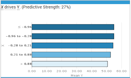
66 Variables

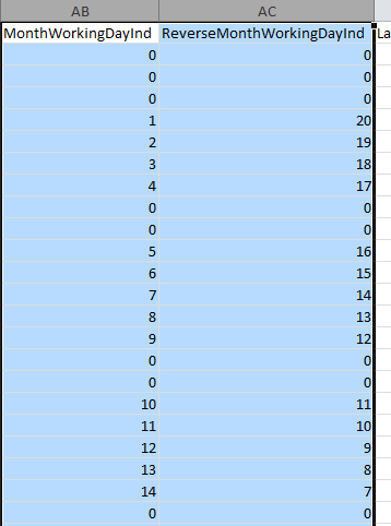
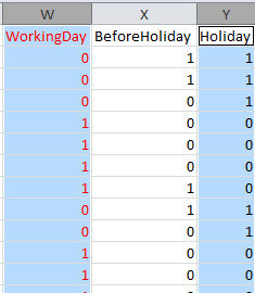
A bunch of very curious variables(66??----PenultimateWednesday) are included that we have never seen before which made us scratch our heads (with delight???). They seem to try and capture the day of the week so we will turn that off some of Autobox's searches to avoid collinearity when we run with these in the first pass. They seem to use a day of year variable which I have never seen before. What book are they getting ideas to use these kind of variables from? Not one that I have ever seen, but perhaps someone can enlighten me? There are two variables that are measuring the number of working days that have occurred in the month and the number left in the month. We did find that some of these variables do have importance in the tests we ran so SAP has some ideas generating useful variables, but many are collinear and this could be called "kitchen sink" modeling. We will do more research into these. There is a holiday variable which also flags working days so the two variables would seem to be collinear. These two end up as the second and third most powerful variables in the SAP model. When we tried these in Autobox, both runs found them significant. Perhaps they measure (implicitly) holidays too? We are not sure, but they help.


There are weather variables which are useful and actually represent seasonality so using both monthly dummies/weekly dummies and the weather variables could be problematic. The holidays have been all combined into one catch all variable. This assumes that each holiday behaves similarly. It should be noted that a major difference is that SAP does not search for lead or lag relationships around the causals while Autobox can do that. Just try running this example in Autobox and then SAP. We ran with all of these curious variables. We then reduced these variables and kept only Holiday, gust, rain, tmean, hmean, dmean, pmean, wmean, fmean, TubeStrike and Olympics and removed the curious other variables. The question which might arise "how much can you trust the weather predictions?", but here we are looking at only the MAPE of the fit so that is not a topic of concern.

SAP ended up with a .13 MAPE when using there long list of causals. The key here is that no outliers are identified in the analysis. This is a distinction and why Autobox is so different. If you ignore outliers they do still exist and yes they exist in causal problems. By ignoring something that doesn't mean it goes away, but ends up impacting you elsewhere such as the model and you likely aren't even aware of its impact. By not being able to deal with outliers your model with causals will be skewed, but no one talks about this in any school or text book so sorry to ruin this illusion for you. Alice in Wonderland(search on alice) thought everything was perfect too, until.....

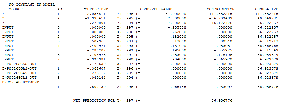
Autobox does stepdown regression, but also does "stepup" where it will search for changes in seasonality(ie day of the week), trend/level/parameters/variance as things sometimes drastically change. If you're not looking for it then you will never find it! s. The MAPE we are presenting can be found in the detail.htm audit report from the Autobox run(hint:near the bottom). We suppressed the search for special days of the month which are useful in ATM data, but not theoretically plausible for this data. Autobox allows for holidays in the Top 15 GDP's, but in general assumes the data is from the US so we will need to suppress that search. We suppressed the search for special days of the month which are useful in ATM daily data as payday's are important, but not theoretically plausible for this data.

To summarize: We can run this a few different ways, but we can't present all of these results down below as it would be too much information to present here. We included some output and the Autobox file (current.asc-rename that if you want to reproduce the results) so you can see for yourself. What we do know is that including ARIMA increases run time.

MAPE's

  • Run using all variables with Autobox default options(suppressing US Holidays, day of month and monthly/weekly dummies). .0883
  • Run using all variables with Autobox default options(suppressing US Holidays, day of month and monthly/weekly dummies). Allow for ARIMA .0746
  • Run using a reduced set of variables(see above) & suppressing US holidays, day of month and monthly/weekly dummies). .1163
  • Run using a reduced set of variables(see above) & suppressing US holidays, day of month and monthly/weekly dummies). Allow for ARIMA .0732
  • Run using only Holiday, Strike/Olympics and rely upon monthly or weekly dummies. .1352
  • Run using only Holiday, Strike/Olympics and rely upon monthly or weekly dummies. Allow for ARIMA .1145
  • Run using a reduced set of variables, but remove the catch all "holiday" variable and create separate 6 main holiday variables that were flagged by SAP as they might each behave differently. (suppressing US Holidays, day of month, and monthly/weekly dummies) .1132
  • Run using a reduced set of variables, but remove the catch all "holiday" variable and create separate 6 main holiday variables that were flagged by SAP as they might each behave differently. (suppressing US Holidays, day of month, and monthly/weekly dummies). Allow ARIMA .0724

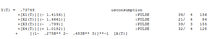
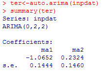
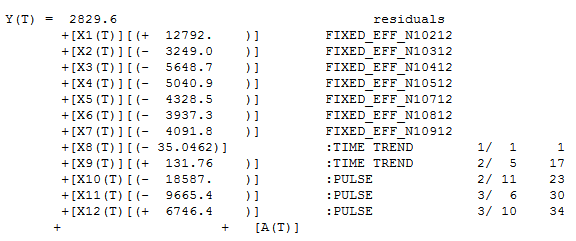
Let's consider the model that was used to develop the lowest MAPE of .0724.

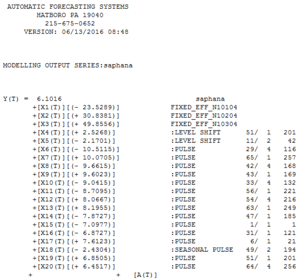
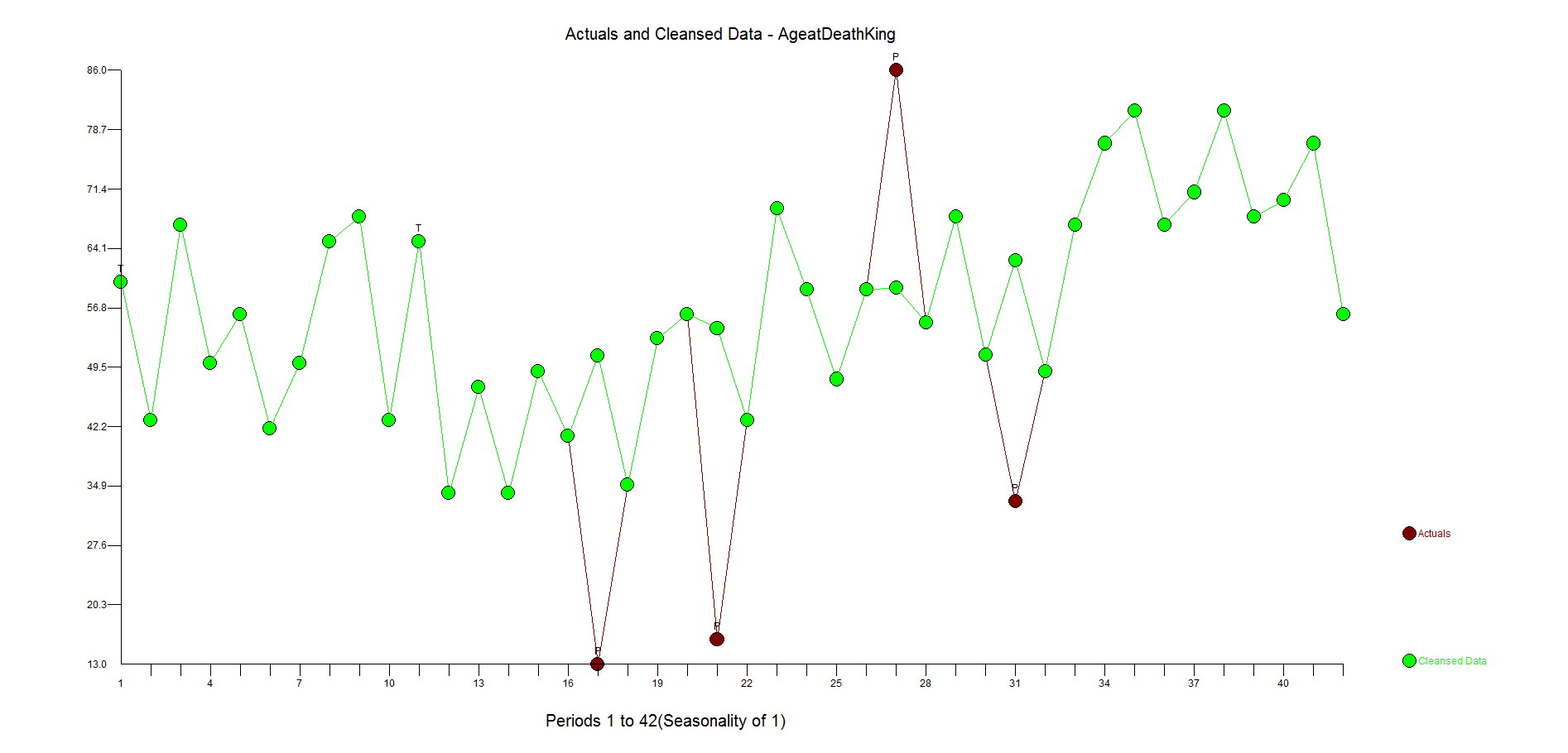
There were 38 outliers identified over the 1,724 observations so the goal is not to have the best fit, but to model and be parsimonious.

So, what did we do to make things right?  We started by deleting all kinds of variables.  There were linearly redundant variables such as WorkingDay that is perfectly correlated (inverse here) to Holiday which by definition should never be done when using dummy variables. The variable "Special Event" is redundant with TubeStrike and Olympics as well.  Special Event name isn't even a number, but rather text and also is redundant.

All other software withholds data whereas Autobox uses all of the data to build the model as we have adaptive technology that can detect change (seasonality/level/trend/parameters/variance plus outliers). We won best dedicated forecasting tool in J. Scott Armstrong's "Principles of Forecasting".  For the record, we politely disagree against a few of the 139 "Principles" as well.

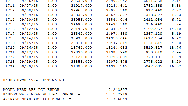
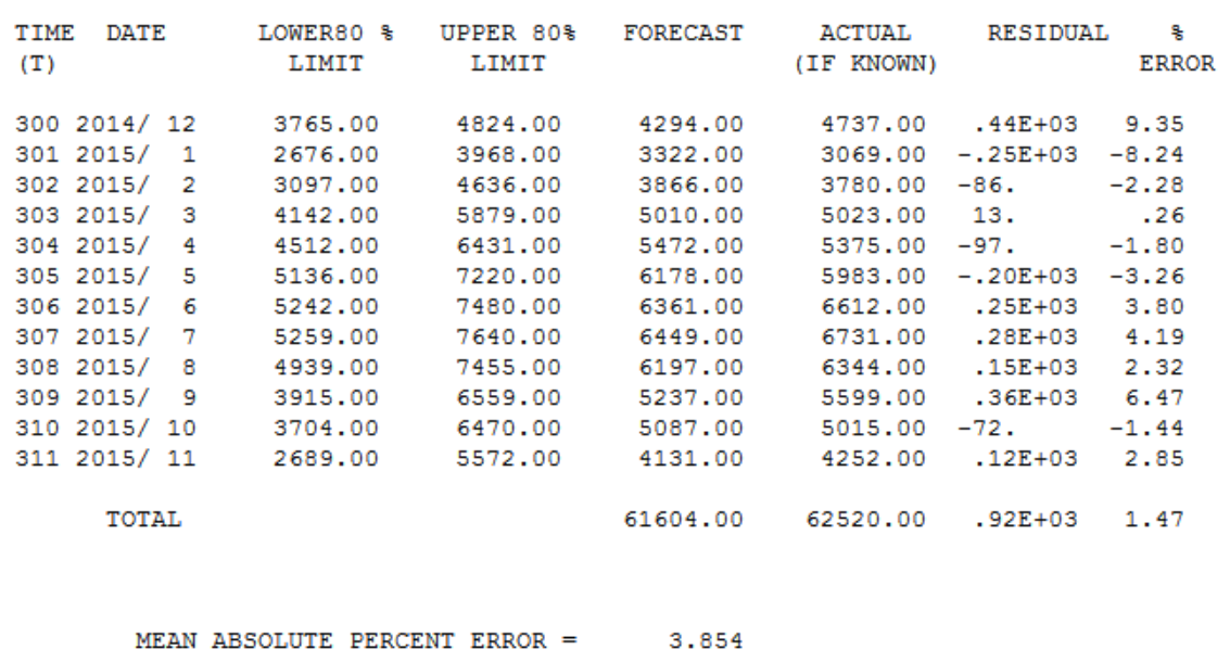
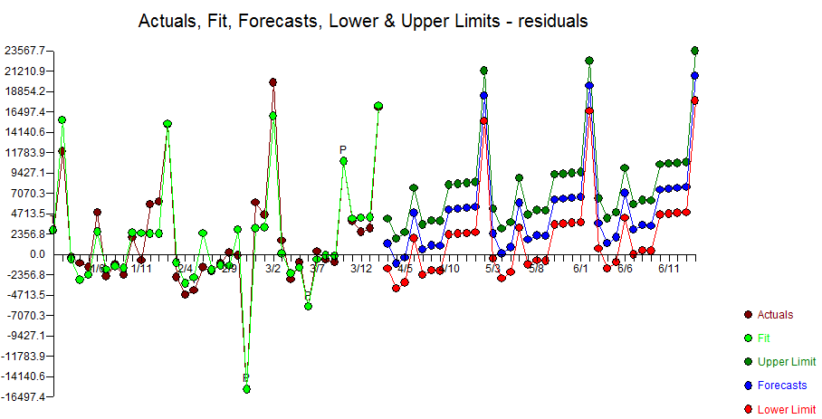
We report the in sample MAPE, in the file "details.htm" seen below...


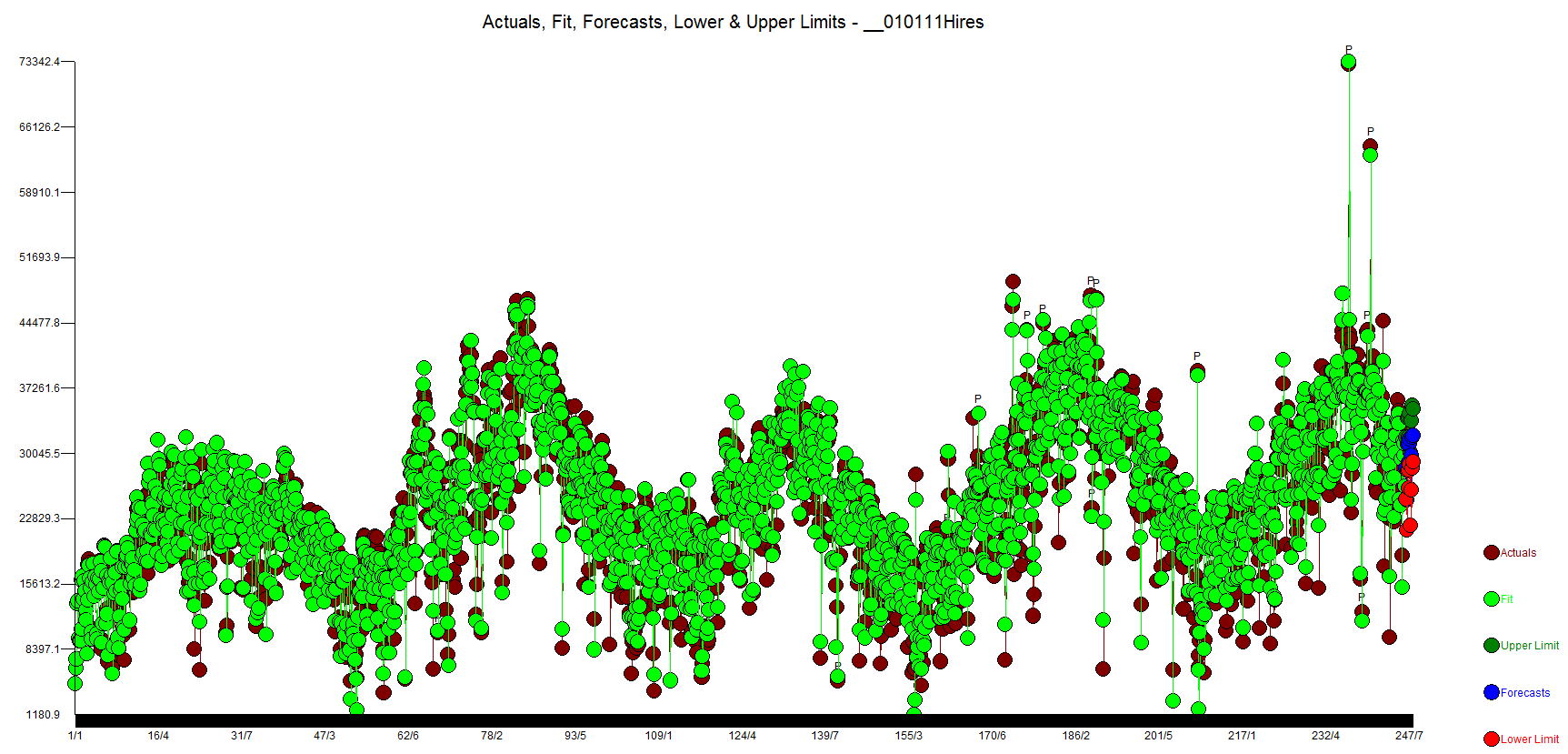
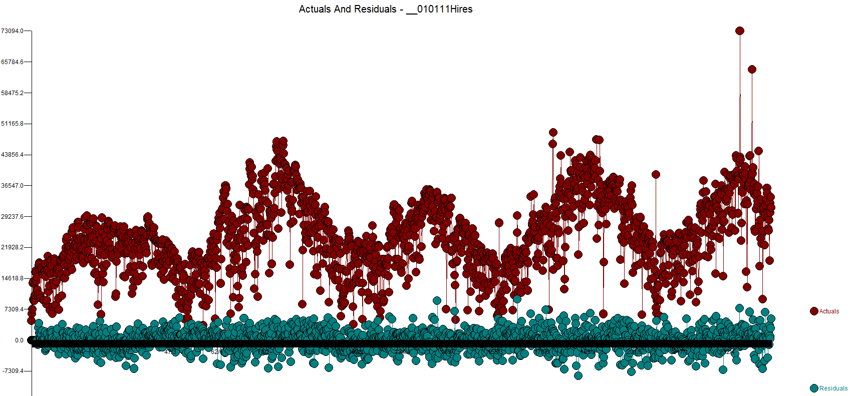
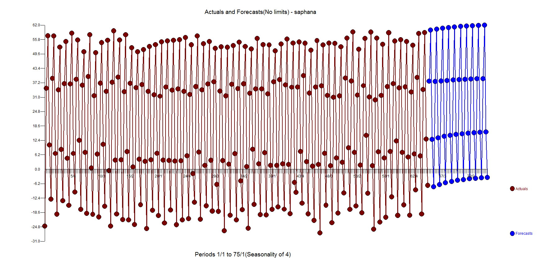
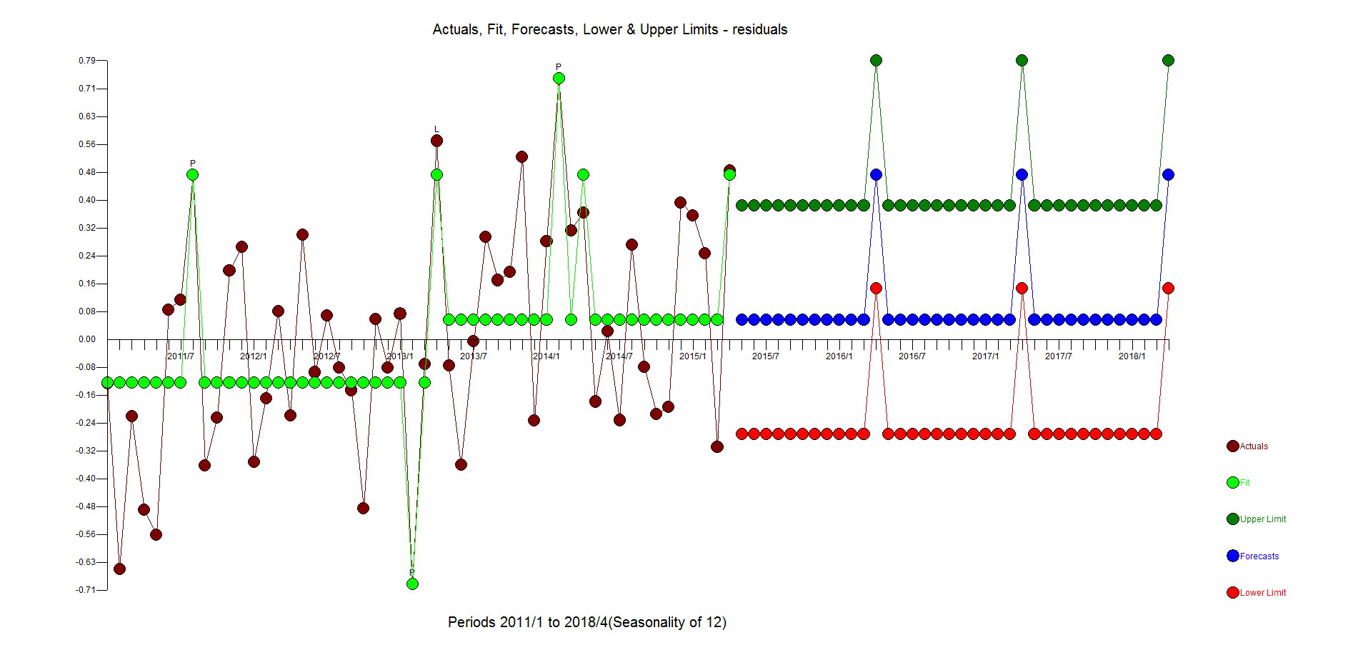
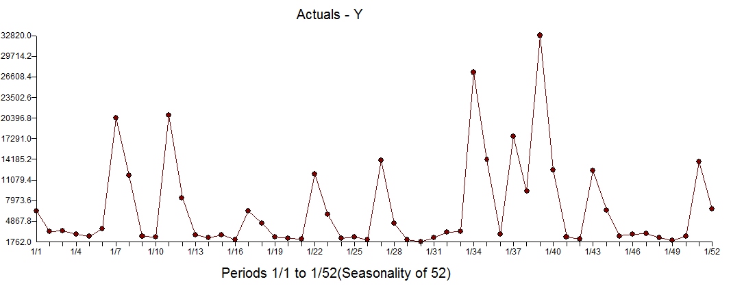
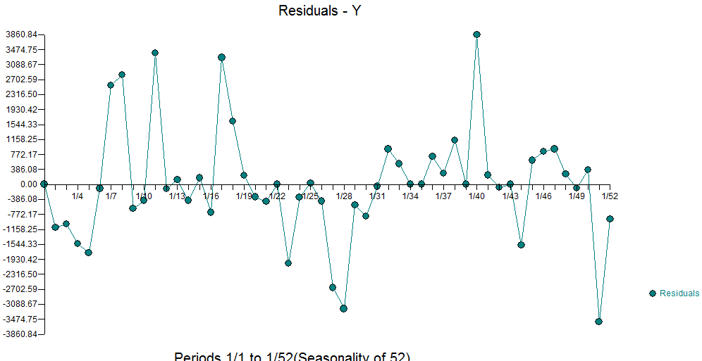
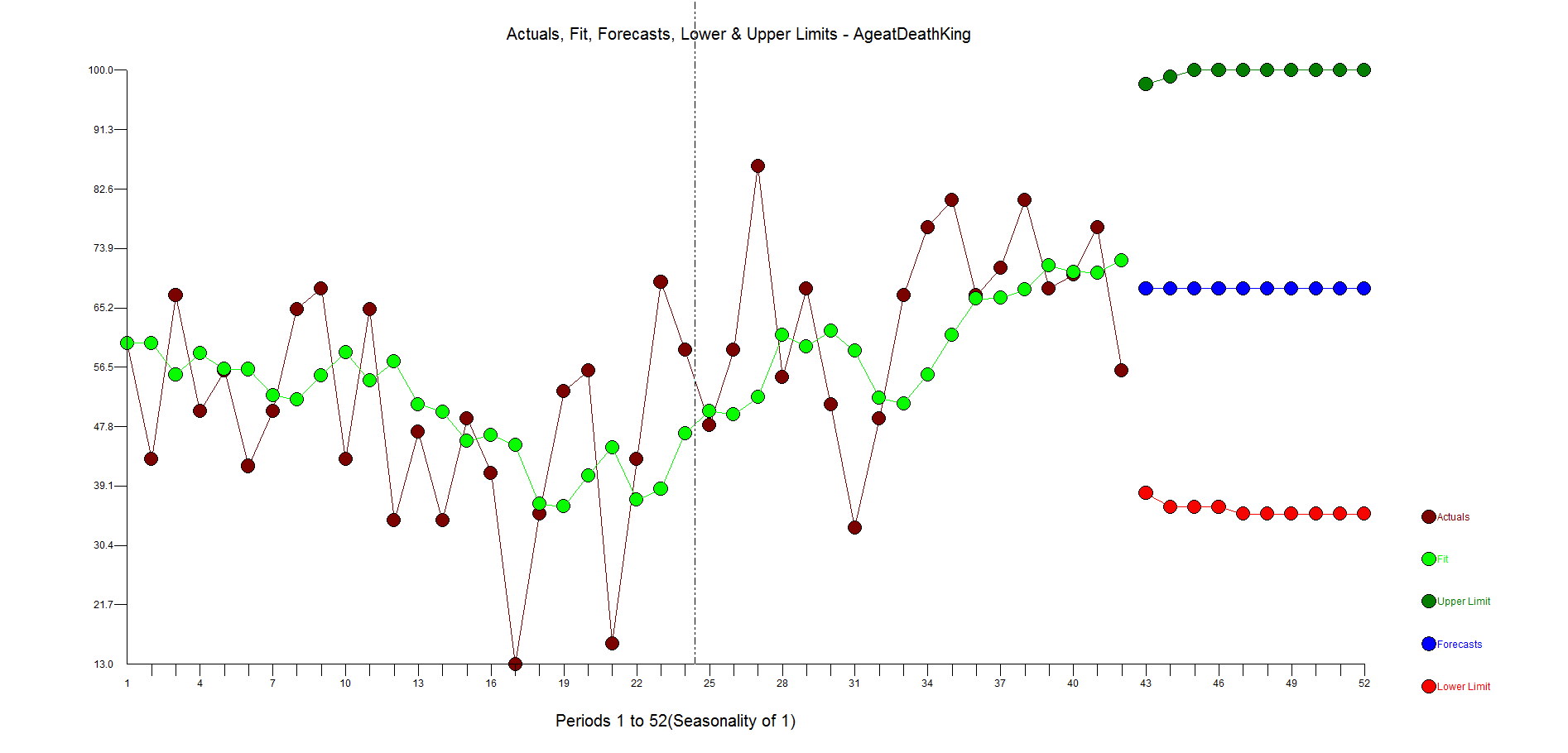
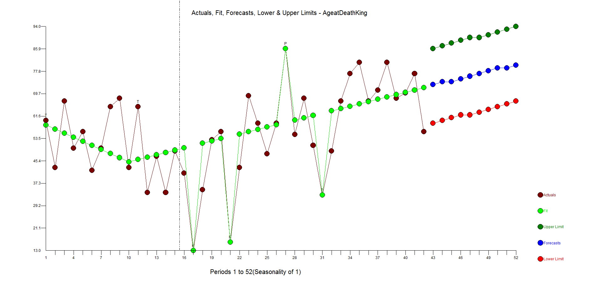
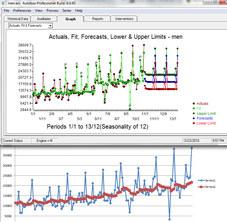
Another way to compare the Autobox and SAP results are by comparing side by side the actual and fit and you will clearly see how Autobox does a better job. The tutorial shows the graph for univariate, but unfortunately not for the causal run!  Here is the graph of the actual, fit and forecast. 


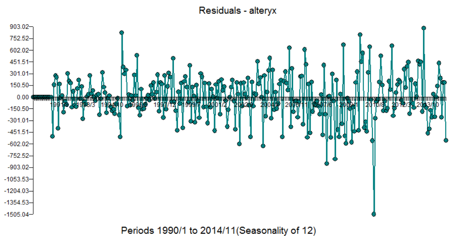
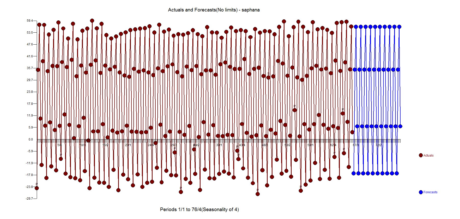
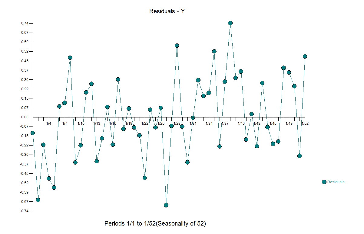
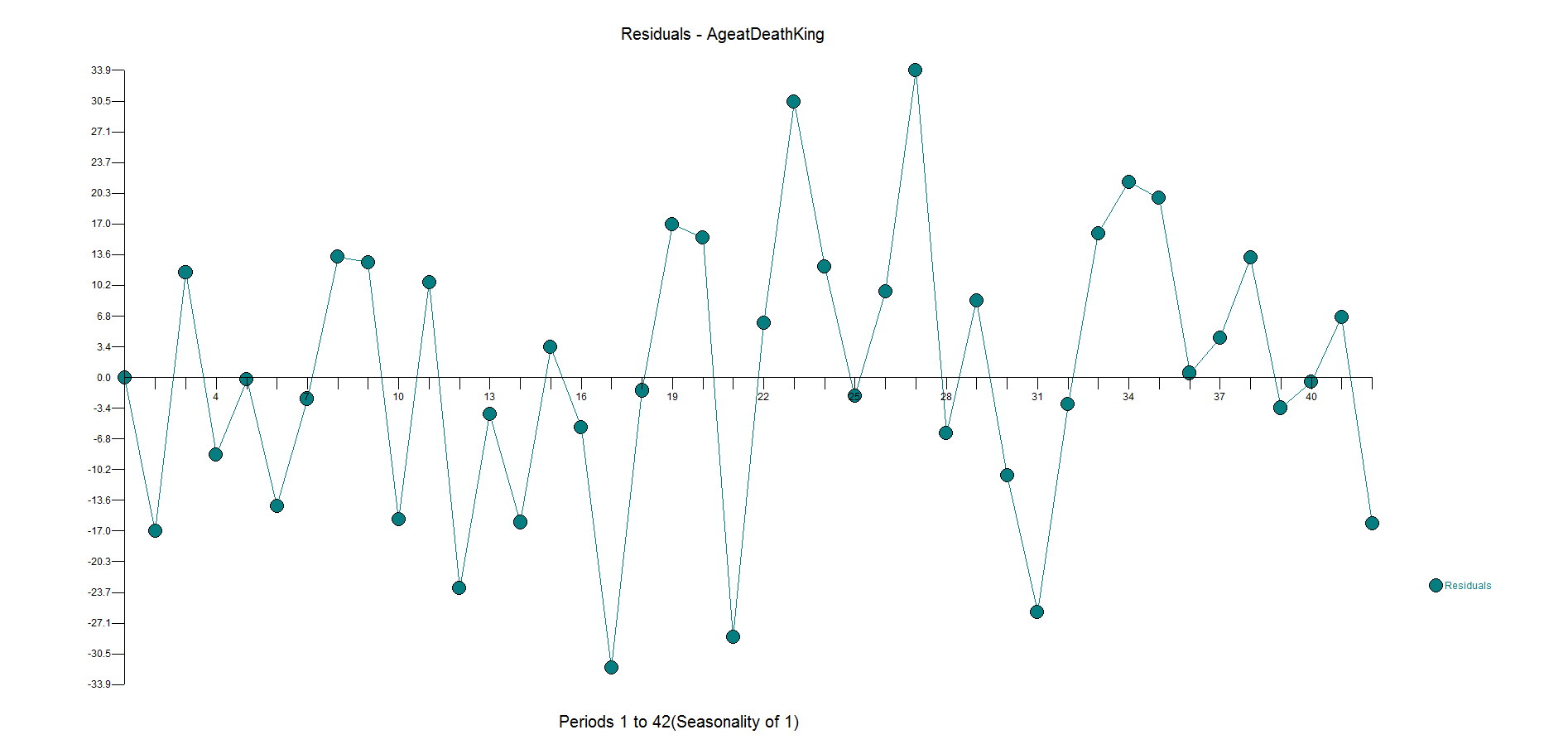
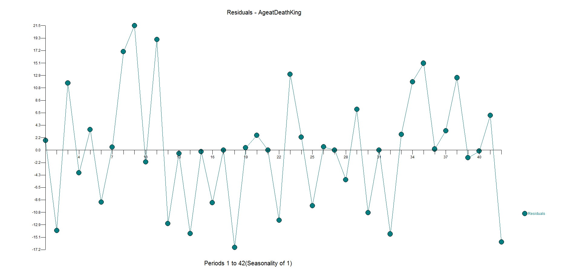
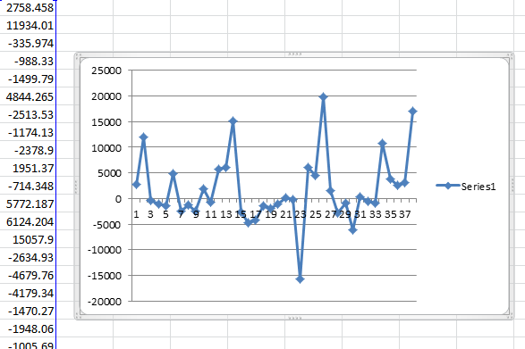
We prefer the actual and residuals plot as you can see the data more clearly.


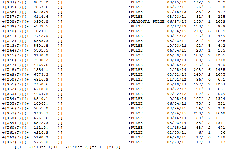
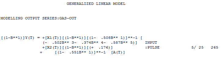
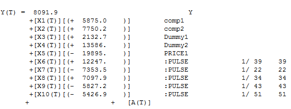
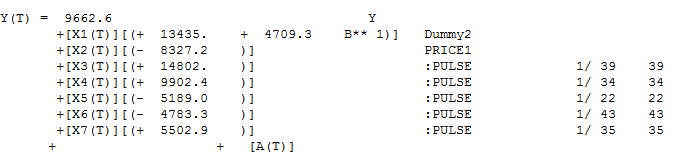
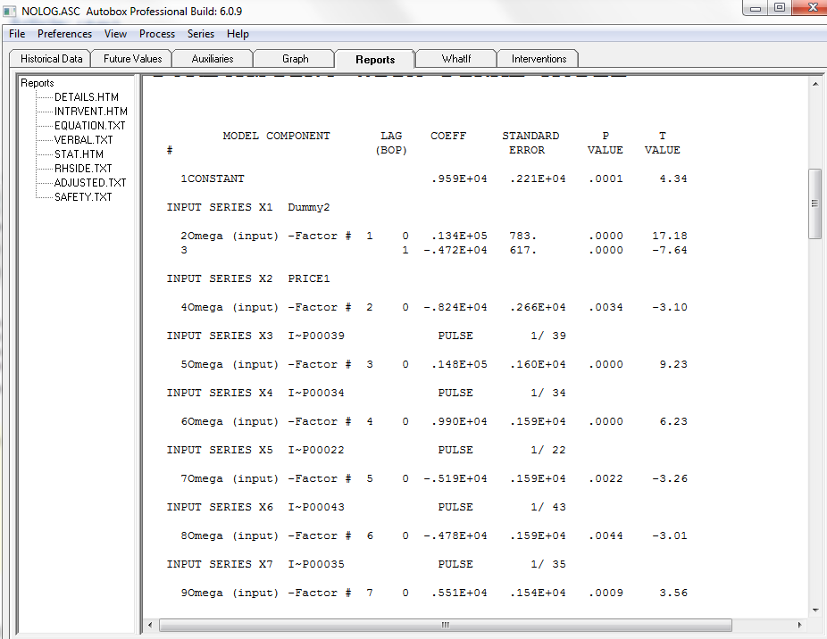
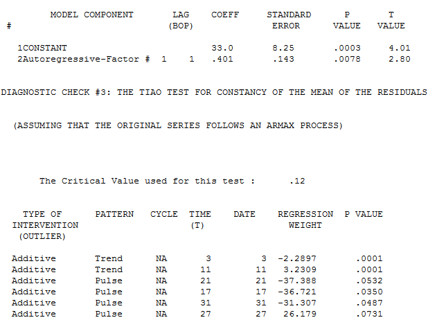
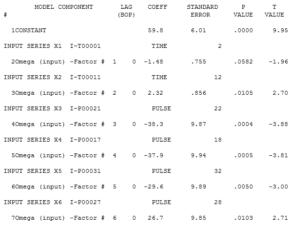
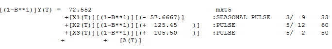
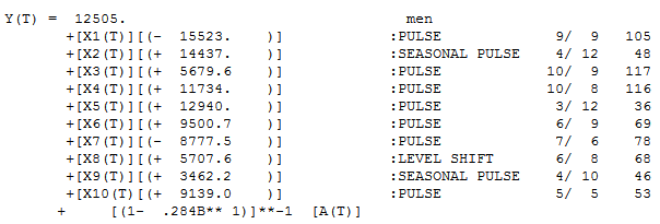
Let's review the model

The sign of the coefficients make sense(for the UK which is cold).   When it's warmer people will skip the car and use the bike, for example so when Temperature goes up (+ sign) then people rent more bikes. When its gusty people will not and just drive. The tutorial explains the variables names in the back. tmean is average temperature,  w is wind,  d is dewpoint, h is humidity, p is barometric pressure, d is real feel temperature.   All 6 holidays were found to be important with all but one having lead or lag impacts.  When you see a B**-2 that means two days before the Christmas volume was low by 5036. Autobox found all 6 days of the week to be important.  The SAP Holiday variable was a mixture of Saturday and Sunday and causes some confusion with interpretation of the model.  This approach is much cleaner.  The first day of the data is a Saturday(1/1/2011) and the variable "FIXED_EFF_N10107" is measuring that impact that Saturday is low by 4114. Sunday is considered average as day 7 is the baseline.  See below  for more on the day of the week rough verification(ie pivot table/contribution %).

Note the "level shift' variables added to the model. This meant that the volume changed up or down for a period and Autobox identified and ADAPTED to it. We call this "step up regression"(nothing there right? Yes, we own that world!) as we are identifying on the fly deterministic variables and adding them to the model. The runs with the SAP variables fit 2012 much better. The first time trend began at period 1 with volume steadily increasing 10.5 units each day. This gets tampered down with the second time trend beginning at 177 making the net effect +4.3 increase per day. 38 outliers were identified which is the key to whole analysis. They are sorted by their entry into the model and really their importance.


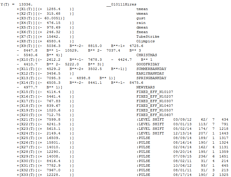
Note the Seasonal pulse where the first day becomes much higher starting at period 1639 and forward with an average 3956.8 higher volume.  Thats quite a lot and if you do some simple plotting of the data it will be very apparent.  Day 1 and Day 2 were always low, but over time Day 1 has become more average,  Note the AR1 and AR7 parameters.

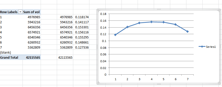
Let's consider the day of the week data by building a pivot table.

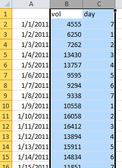
And getting this % of the whole. We call this the contribution %. Day 7 in Excel is Saturday which is low and notice Sunday(baseline) is even lower(remember that the holiday variable had a negative sign? The sign for Saturday was +1351.5 meaning it was 1351 higher than Sunday which matches the plot below. This type of summarization ignores trend, changes in day of the week impacts, etc. so be careful. We call this a poor man's regression because those percentages would be the coefficient if you ran a regression just using day of the week. It is directional, but by not means accurate as Autobox. We use this type of analysis to "roughly verify" Autobox with day of the week dummies, monthly dummies, and day of the month effects using pivot tables. The goal is not to overfit, but rather be parsimonious. Auto.arima is not parsimonious.


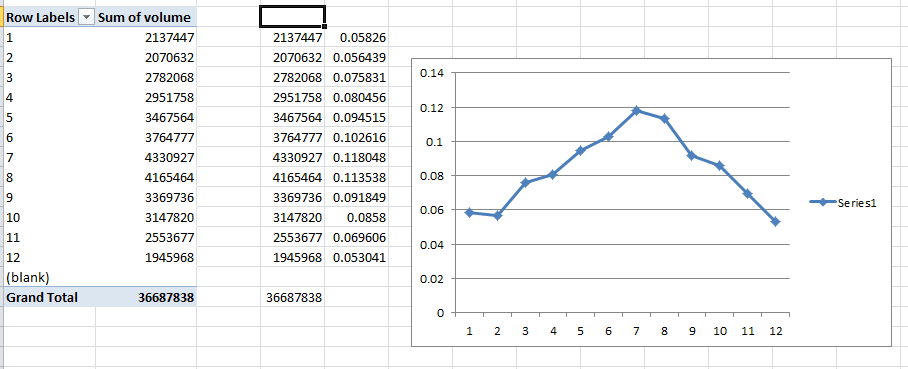
Let's look at the monthly breakout. Jan,Feb,Dec are average and the other months are higher with a slope up to the Summer months and down back to Winter.  The temperature data replaces the use of monthly or weekly dummies here.


It wasn't until we started talking with probabilitymanagement.org's Sam Savage at the INFORMS2015 Business Analytics about modifying Autobox to create "simulated forecasts" that are ready for their SIPmath Tools did we see the opportunity to correct a long standing thorn in our side.  We don't think the rest of the planet has figured this out.  Go ask your forecasting software about this and see what they say!  This should shake up your CONFIDENCE.

Here is the  "Unveiling of Two Critical Assumptions" that you may not have been told:

Assumptions:

1)The estimated parameters are the population parameters

2)Pulse outliers that get identified and cleansed may happen again in the future.  Read that sentence again as we are not talking about a debate about how to model outliers or the impact on the forecast, but only related to the confidence limits.

In the mid 1980’s, when AUTOBOX was the first commercially available software which incorporated four Intervention Detection schemes in the development of ARIMA and Transfer Function models. Outliers("Pulses"), Level Shifts, Seasonal Pulses and Local Time Trends can all play an important role in discovery the basic stochastic structure as ignoring this blocks identifying the ARIMA component. Identification and incorporation of these four empirically discoverable model components enable robust model estimation. This step is necessary to ensure that the error process has a stationary/normally distributed error process yielding valid tests of statistical significance and subsequent model sufficiency.

Pulses do not play a role in forecasting as they are “expected to not exist in the future” whereas the other three do. Let's state here that of course there are exceptions and sometimes outliers should be allowed! Early on in the development of time series solutions’ researchers (including us) recognized that while Pulses were important incorporating them led to an unwarranted rosy view of forecasting uncertainty. Forecasting uncertainty was also plagued by the fact that no consideration is made for the uncertainties in parameter estimates as the well-known (but ignored until now) Box-Jenkins procedures tacitly assumed that the estimated parameters are identical to the unknown population parameters as the only contributor to the computation of the confidence limits were the psi weights and the error variance.

In the forecasting context, removing outliers is can be very dangerous. If you are forecasting sales of a product and let’s assume that there was a shortage of supply thus there are periods of time with zero sales. Recall that sales data is not demand data. The observed flawed time series then contains a number of outliers/pulses. Good analysis detects the outliers, removes them or in effect replaces the observed values with estimates and then proceeds to model and then forecast. You assumed that no supply shortage like this will happen in future. In practical sense, you compressed your observed variance and estimated error variance. So, if you show the confidence bands for your forecast they will be tighter/narrower than they would have been if you did not remove the outliers. Of course, you could keep the outliers, and proceed as usual, but this is not a good approach either since these outliers will distort the model identification process and of course the resultant model coefficients.

A better approach in this case is to continue to require an error distribution that is normal (no fat tails) while allowing for forecast uncertainties to be based upon an error distribution with fat tails. In this case, your outlier will not skew the coefficients too much. They'll be close to the coefficients with an outlier removed. However, the outlier will show up in the forecast error distribution. Essentially, you'll end up with wider and more realistic forecast confidence bands.

AUTOBOX provides an integrated and comprehensive approach to identify the outliers using the rigorous Intervention Detection procedure leading to robust ARIMA parameters and delivering a good baseline forecast. It now develops simulated forecasts which are free of pulse effects thus more correctly reflecting reality. In this way, you get the best of both worlds namely a good model with a good baseline forecast and more realistic confidence limits that INCLUDE OUTLIERS for the forecast. These uncertainties obtained via simulation have the benefit that they do not assume zero pulses in the future, but rather reflect their random reoccurence and secondly that the estimated model parameters are known without error.

So, you have robust parameter estimates and more realistic forecast uncertainties.  Now it is time to go ask your software vendor about this or find a new tool!

Let's evaluate auto.arima vs a Robust Solution from an example by it's author, Rob Hyndman, in his R text book.

Do this exercise in R and see for yourself!

Now, this is only one example that we are discussing here, but it reveals so much about R's auto.arima.  It's a "pick best" approach of models that minimizes the AIC with no attempt to diagnose other effects like outliers, changes in level/trend/seasonality. There are many other examples we have seen that show flaws in auto.arima as we have seen them discussed on crossvalidated.com.

The data set we are examining is found in Chapter 8.5 of Rob's book called "U.S. Consumption" and it is a quarterly dataset with 164 values.  Rob observes no seasonality, so he forces the model to not look for seasonality. Now this might be true, but there is something else going on here that smells funny as the name of the software is "auto", but a human is intervening.  Is it really necessary to have the need for this?  What consequences would happen if the user wasn't there to do this we wondered? We explore that down below.

The auto.arima generated model is an MA3 with lags 1,2,3 and a constant.  All coefficients are significant and the forecast looks good so everything is great, right?  Well, not really.


The forecasts from a Robust application(Autobox) and auto.arima end up being just about the same, but the "style" and "process" from these two tools need to be highlighted as their are stark differences in the modeling assumptions and detection of other patterns.  Box-Jenkins laid out a path of Identification, Estimation, Necessity and Sufficiency with perhaps model revision and then forecasting.  Auto.arima is not following this path. Auto.arima's approach is a "one and done" approach where the model is identified and that it is it.

Let's see what is really going on in terms of methodology and what assumptions are made and what is missing in auto.arima. auto.arima's process leaves a set of residuals which are obviously NOT random. The residuals show artifacts from which information can be learned about the data and perhaps a better model. Here are the auto.arima's residuals which clearly show that the first half of the data is very different from the second half.  Do residuals matter?  Yes.  The first thing you learn when studying time series is that if the errors are not random and show pattern(s) then your model is not sufficient and needs more work.


The data is 41 years of historical Consumption and over time policy, economy and personal choice change.  This data has had a change in the underlying model.  Autobox detected a change in the parameters of the model and deleted the first 67 observations.  Autobox uses the Chow test in time series to detect change.  It's a unique feature and besides being useful in forecasting, it is also useful in detecting change in data in general.  If your analysis was being done back in the periods where the change in the model really began to be noticed(the next few years after period 67) you would see a bigger difference in the forecasts between the two methods and of course right after an intervention took place.


The model is different than the auto.arima in a couple more ways.  Autobox finds 4 outliers and "step-ups" the model to include 4 dummy(deterministic) variables to "adjust" the data to where it should have been.  If you don't do this, then you can never identify the true pattern in the data(they call this DGP-Data Generating Process). Also, there is no need for the MA1 as it is unnecessary.  So, it is true that there is no quarterly effect in the data, but there is no need to "turn off" the search for seasonality.


A thank you to Michael Mostek and Giorgio Garziano for providing some R expertise in trying to run the problem and explain why Rob may have needed to turn off seasonality due to estimation problems with the ML method. Giorgio had some ideas on how to model this data, but we want to measure auto.arima's excellence and not Giorgio's.

We asked a question above if there were bad consequences if a user were to allow R to look for seasonality.  The answer it seems that "yes" there is a need for the user to do this override to not look for seasonality as what we found out DURING this BLOG analysis when we were just about done with this BLOG where we wondered what would happen if we were to allow auto.arima to search for seasonality??  If you do, there is a poor model and forecast.  The model is fooled into believing there is seasonality as it has four seasonal parameters. It is quite a complicated model compared to what it COULD have been. It is very overparameterized. Therefore there is incorrect seasonality in the forecast.  This BLOG posting on R's auto.arima time series modeling and forecasting could become a regularly occurring segment here on the Autobox BLOG.  The residuals from this model are also indicative of something being missed.


What R kicks out when you run this model is an error message.

"Warning message:

In auto.arima(usconsumption[, 1]) :

Unable to fit final model using maximum likelihood. AIC value approximated


We find a remedy from crossvalidated.com when this happens which generates now a third model where you need to override auto.arima's defaults with this code

fit <- auto.arima(usconsumption[,1],approximation=FALSE,trace=FALSE)

This model relies heavily on the last value to forecast which is why the forecast is immediately high that whereas Rob's(in his book) and the model from Autobox are similar.


Please feel free to comment and hear your thoughts!!


Posted by on in Forecasting

In 2011, IBM Watson shook our world when it beat Ken Jennings on Jeopardy and "Computer beats Man" was the reality we needed to accept.


IBM's WatsonAnalytics is now avalilabe for a 30 day trial and it did not shake my world when it came to time series analysis.  They have a free trial to download and play with the tool. You just need to create a spreadsheet with a header record with a name and the data below in a column and then upload the data very easily into the web based tool.


It took two example time series for me to wring my hands and say in my head, "Man beats Computer".  Sherlock Holmes said, "It's Elementary my dear Watson".  I can say, "It is not Elementary Watson and requires more than pure number crunching using NN or whatever they have".


The first example is our classic time series 1,9,1,9,1,9,1,5 to see if Watson could identify the change in the pattern and mark it as an outlier(ie inlier) and continue to forecast 1,9,1,9, etc.  It did not.  In fact, it expected a causal variable to be present so I take it that Watson is not able to handle Univariate problems, but if anyone else knows differently please let me know.


The second example was originally presented in the 1970 Box-Jenkin's text book and is a causal problem referred to as "Gas Furnace" and is described in detail in the textbook and also on NIST.GOV's website.  Methane is the X variable and Y is the Carbon Dioxide output.  If you know or now closely examine the model on the NIST website, you will see a complicated relationship where there is a complicated relationship between X and Y that occurs with a delay between the impact of X and the effect on Y (see Yt-1 and Yt-2 and Xt-1 and Xt-2 in the equation).  Note that the R Squared is above 99.4%!  Autobox is able to model this complex relationship uniquely and automatically.  Try it out for yourself here! The GASX problem can be found in the "BOXJ" folder which comes with every installed version of Autobox for Windows.

Watson did not find this relationship and offered a predictive strength of only 27%(see the X on the left hand of the graph) compared to 96.4%.  Not very good. This is why we benchmark. Please try this yourself and let me know if you see something different here.


gasx watson


Autobox's model has lags in Y and lags in the X from 0 to 7 periods and finds an outlier(which can occur even in simulated data out of randomness).  We show you the model output here in a "regression" model format so it can be understood more easily. We will present the Box-Jenkins version down below.

gasx rhs


Here is a more parsimonious version of the Autobox model in pure Box-Jenkins notation.  Another twist is that Autobox found that the variance increased at period 185 and used Weighted Least Squares to do the analysis hence you will see the words "General Linear Model" at the top of the report.


gasx


Posted by on in Forecasting

Announcing the Option to run Autobox with where it will calculate Price elasticities automatically. Why is this so powerful?  If you have ever calculated a price elasticity, you might already know the modeling tradeoffs by using LOGS for a simplistic trick to quickly build the model to get the elasticity and the downside of doing so.  We aren't trading off anything here and using Autobox's power to do build a robust model automatically and considerig the impact of lags, autocorrelation and outliers.

We are rolling out an Option for Autobox 7.0 Command Line Batch to calculate "Short-Run" Price Elasticities.  The Price Elasticity Option can be purchased to produce Price elasticities automatically AND done the right way (we will explain that below) as opposed to assuming the model form to get a fast, but sub-standard econometric approach to calculating Price elasticities.  The Option allows you to specify what % change in price, specify the problems you want to run and then let Autobox run and model the data and produce a one period out forecast.  Autobox will run again on the same data, but this time using the change in price and generate another forecast and then calculate the elasticity with the supporting math used to calculate it stored in a report file for further use to prepare pricing strategy. That introduction is great, but now let's dive into the importance of modeling the data the right way and what this means for a more accurate calculation of elasticities! Click on the hyperlinks when you see them to follow the example.

For anyone who has calculated a price elasticity like this it was in your Econ101 class.   You may have then been introduced to the "LOG" based approach which is a clean and simple approach to modeling the data in order to do this calculation of elasticity as the coefficient will be the elasticity.  Life isn't that simple and with the simplicity there are some tradeoffs you may not be aware that came with this simplicity.  We like to explain these tradeoffs like this "closing the door, shutting the blinds, lowering the lights and doing voodoo modeling". Most of the examples you see in books and literally just about everywhere well intentioned analysts try and do their calculations using a simple Sales (Quantity) and Price model.  There typically is no concern for any other causals as it will complicate this simplistic world. Why didn't your analyst tell you about these tradeoffs?  You probably didn't ask.  If you did, the analyst would say to you in a Brooklyn accent "Hey, read a book!" as the books show it done this way. Analysts take LOGS of both variables and then can easily skip the steps needed in the first link above and calculate the elasticity, running a simple regression ignoring the impact of autocorrelation or other important causals and voila you have the elasticity which is simply found as the coefficient in the model.  The process is short and sweet and "convenient", but what happens when you have an outlier in the data?  What happens if you need to include a dummy variable?  What about the other causals? What about lags in the X?  What about autocorrelation? Does their impact just magically disappear? No.  No and no.

Let's review an example that Shazam uses from a text book to show how to model elasticity.  The "Canned Tuna" example comes from a textbook called "Learning and Practicing Econometrics" and it does try account for other causals so some credit is due here as most just use Price as the only causal.  We thought this was a good example to delve into as it actually tried to consider more complexities with dummies.  In the end, you will still want to forget everything you learned in that example and wish for a robust solution.  Here they only take LOGS of the Y variable as there are two causal dummy variables plus two competitor price variables.  They report the elasticity as -2.91%. They also do some kind of gyrations to get the elasticities of the dummies.   Now, we know that there is no precisely right answer when it comes to modeling unless we actually simulate the data from a model we specified. What we do know is that all models are wrong and some are useful per George Box.  With that said, the elasticity from a model with little effort to model the relationships in the data and robustitfied to outliers is too simple to be accurate.  Later on, we estimate an elasticity using the default of -2.41% but take no LOGS.  Is it that different?  Well, yes, it is. It is about 20% different.  Is that extra effort worth it? I think so. As for the model used in the text book and estimated in Shazam, the ACF/PACF of the residuals look well behaved and if you look at the t-values of the model everything is significant, but what about the residuals?  Are they random??? No.  The residual graph shows pattern in that it is not random at all.


RES shazam

If you take the residuals and model them automatically in Autobox it finds a level shift suggesting that there is still pattern and that the model is insufficient and needs more care.


ACCFF residuals1


I would ask you to stop reading here and don't read the rest just yet.  I put a big graph of the history of Y right below so that your eyes won't see what's next.  Download the data set from the Shazam website and spend about 3 full days(and possibly nights) verifying their results and then building your own model using your tools to compare what Autobox did and of course questioning everything you were taught about Elasticities using LOGS. Feel free to poke holes in what we did. Maybe you see something in the data we don't or perhaps maybe Autobox will see something in the data you won't?  Either way, trying to do this automatically for 10,000 problem sets makes for a long non-automatic process.


just history

Let's not take LOGs and not consider any lags in the model or autocorrelation, but let's robustify the estimation of the Canned Tuna example by considering outliers, but let's NOT look for lags in the causals just yet. The signs in the model all make sense and the SOME outliers make sense as well(explained fully down below). It's not a bad model at all, but the elasticity is -5.51 and very far from what we think it should be. Comp1 and Comp2 is the competitor prices.

robustified

If we look at the ACF of the residuals, a small blip at 1 and 12 which really are not worth going after as they are marginal.

ACF residuals

The residuals show what looks to be outliers.  While outlier detection was used, there are some things outliers can't fix.....bad modeling.

RES robust


The issue with the Canned Tuna example is that there were variables being estimated and forced into the model aren't important at all and by including them in a "kitchen sink" type fashion they create "error" in the model specification bias and impacts the ability to accurately measure the elasticity plus not dealing with outliers.  Here are the Autobox results when you flag all of the causals to consider lag impacts(ie data_type=2).  It dropped three variables.  There was a lag impact which which was being ignored or really mismodeled by including the first dummy which has no explanatory power in the model.  There are some outliers identified.  Period 1/22 and 1/43 had an increase in sales, but those two promotions were much much lower than the others and are being adjusted up. In a similar fashion, the outliers found at 1/34, 1/35 and 1/39 were adjusted down as the promotions were way higher than they were typically. The elasticity calculated from the Autobox output is -2.41%.


model1


Do the residuals look more random?  Yes.  Are there some outliers that still exist.  Well, yes but if you remove all the outliers you will have just the mean. You don't want to overfit.  You have to stop at some point as everything is an outlier compared to the mean.  Compare the size of these residuals with the graph above and this and the scale is much much smaller reflecting a better model.


residuals shazamified


Here are the model statistics.


nolog


Take a close look where dummy 1 was being promoted that week.  Take a look at weeks 1/2, 1/3, 1/9, 1/10, 1/24, 1/26, 1/36, 1/41, 1/42, 1/45, 1/46, 1/47, and 1/52.  None of them even did anything for sales.  Now there was one other area which could be debated at 1/17, 1/18 as having an impact, but just by eye it is clear that Dummy 1 is not a player.  What is clear is that Dummy 2 has an impact and that the week after it is still causing a positive impact.


Posted by on in Forecasting

Here is a BLOG discussion on forecasting that discusses forecasting and Autobox.


It's been 6 months since ourlast BLOG.  We have been very busy.


We engaged in a debate on a linkedin discussion group over the need to pre-screen your data so that your forecasting algorithm can either apply seasonal models or not consider seasonal models.  A set of GUARANTEED random data was generated and given to us as a challenge four years ago.  This time we looked a little closer at the data and found something interesting. 1)you don't need to pres-creen your data 2)be careful how you generate random data


Here is my first response:

As for your random data, we still have it when you send it 4 years ago. I am not sure what you and Dave looked at, but if you download run the 30 day trial now and we always have kept improving the software you will get a different answer and the results posted here on dropbox.com.https://www.dropbox.com/s/s63kxrkquzc6e00/output_miket.zip

I have provided your data(xls file),our model equation (equ), forecasts(pro), graph(png) and audit of the model building process(htm).

Out of the 18 examples, Autobox found 6 with a flat forecast, 7 with 1 monthly seasonal pulse or a 1 month fixed effect, 4 with 2 months that had a mix of either a seasonal pulse or a 1 month fixed effect, 2 with 3 months that had a mix of either a seasonal pulses or a 1 month fixed effect.

Note that no model was found with Seasonal Differencing, AR12, with all 11 seasonal dummies.

Now, in a perfect world, Autobox would have found 19 flat lines based on this theoretical data. If you look at the data, you will see that there were patterns found where Autobox found them that make sense. There are sometimes seasonality that is not persistent and just a couple of months through the year.

If we review the 12 series where Autobox detected seasonality, it is very clear that in the 11 of the 12 cases that it was justified in doing so. That would make 17 of the 18 properly modeled and forecasted.

Series 1 - Autobox found feb to be low. A All three years this was the case. Let's call this a win.

Series 2 - Autobox found apr to be low. All three years were low. Let's that call this a win.

Series 3- Autobox found sep and oct to be low. 4 of the 6 were low and the four most recent were all low supporting a change in the seasonality. Let's call this a win.

Series 4- Autobox found nov to be low. All three years were low. Let's call this a win.

Series 5- Autobox found mar, may and aug to be low. All three years were low. Let's call that a win.

Series 7- Autobox found jun low and aug high. All three years matched the pattern. Let's call that a win.

Series 10 - Autobox found apr and jun to be high. 5 of the 6 data points were high. Let's call this a win.

Series 12 - Autobox found oct to be high and dec to be low. All three years this was the case. Let's call this a win.

Series 13 - Autobox found aug to be high. Two of the three years were very very high. Let's call this a win.

Series 14 - Autobox found feb and apr to be high. All three years this was the case. Let's call this a win.

Series 15 - Autobox found may jun to be high and oct low. 8 of the 9 historical data points support this, Let's call this a win.

Series 16 - Autobox found jan to below. It was very low for two, but one was quite high and Autobox called that an outlier. Let's call this a loss.

A little sleep and then I posted this response:

After sleeping on that very fun excercise, there was something that still wasn't sitting right with me. The "guaranteed" no seasonality statement didn't match with the graph of the datasets. They didn't seem to have randomness and seemed more to have some pattern.

I generated 4 example datasets from the link below. I used the defaults and graphed them. They exhibited randomness. I ran them through Autobox and all had zero seasonality and flat forecasts.

http://www.random.org/sequences/


Posted by on in Forecasting

When to use (and not use) the Box-Cox Test to determine the optimum transformation for your data.

There are four ways to remedies in play to deal with non-trivial data:

1)Outlier detection

2)Parameter Change detction

3)Determinstic changes in the error variance (ie variability in the errors is not related to the level of the series)

4)Box-Cox(ie Power) Transfromations where the error variance is related to the level of the series

The choice of these remedies all have their positives and negatives.  Some software IGNORES the richness of possible remedies.  For example, if you couldn't implement 1,2,3 then you might have to rely upon on 4.  So, sometimes you are stuck with your software.  Here is an example of Quartic reciprocals "found" to be optimal, but of course the analyst didn't have access to alternative, simpler remedies.

The Box-Cox test premises that the model in place is the best model and that the parameters of the model are invariant over time. Furthermore, it is assumes that the variance of the errors does not have structural breaks or can be described by an ARIMA process.  Additionally, the assumption is made that the errors from the model are free of Pulses/Level Shifts/Seasonal Pulses and or Local Time Trends which of course they likely won't be.

IF and only IF all of this is true then the Box-Cox test will yield the best lambda or power transformation. Review the following figure to better understand the implications of the “best lambda” as it decouples the relationship between the and the Variability of the errors and the Expected Value. For example, note that a log transform is a lambda of 0.0 while a square root transform is .5.

You have the option(option =2 when running) which is unique in that all of the items listed above will be addressed in the process, to provide a list of trial lamda's which are then evaluated. This option is when you might have a Note that with our automatic option (option -1), logs are the only transformation evaluated.

Some example transformations


You should be.  There is information to be MINED in the model.  Macro conclusions can be made from looking at commonalities across different series(ie 10% of the SKUs had an outlier four months ago---ask why this happened and investigate to learn what you are doing wrong or perhaps confirm what you are doing right!...and perhaps the other 90% SKUs also had some impact as well, but the model didn't detect it as it was borderline.  You could then create a causal variable for all of the SKUs and rerun and now 100% of the SKUs have the intervention(maybe constrain all of the causals to stay in the model or lower the statistical test to accept them into the model) modeled to arrive at a better model and forecast.  Let's explore more ways to use this valuable information:


LEVEL SHIFTS

When hurricane Sandy hit last October, it caused a big drop for a number of weeks.  Your model might have identified a "level shift" to react to the new average.  The forecast would reflect this new average, but we all know that things will return, but the model and forecast aren't smart enough to address that.  It would make sense to introduce a causal variable that reflected the drop due to the hurricane, BUT the future values of the causal would NOT reflect the impact so the forecast would return to the original level.  So, the causal would have a lot of leading zeroes, and 1's when the impact of Sandy was felt and 0's when the impact would disappear.  You could actually transition the 1 to a 0 gradually with some ramping techniques we learned from the famous modeler/forecaster Peg Young of the US DOT. The 0 dummy variable might increment like this 10,0,0,0,0,0,0,,1,1,1,1,1,1,1,.9,.8,.7,.6,.5,.4,.3,.2,.1,0,0,0,0,0,0,etc.


OUTLIERS

When you see outliers you should be reviewiing them to see if there is any pattern to them.  For example, if you don't properly model the "Super Bowl" impact, you might see an outlier on those days.  It takes a little time and effort to review and think "why" does this happen.  The benefits of taking the time to do this can have a powerful impact. You can then add a causal with a 1 in the history when the Supewr Bowls took place and then the provide a 1 for the next one.  For monthly data, you might see a low June as an outlier.  Don't adjust it to the mean as that is throwing the baby away with the bath water.  This means you might not be modeling the seasonality correctly. You might need an AR12, seasonal differencing or seasonal dummies.


SEASONAL PULSES

Let's continue with the low June example.  This doesn't necessarily mean all months have seasonality and assuming a model instead of modeling the data might lead to a false conclusion for the need of seasonality.  We are talking about a "seasonal pulse" where only June has an impact and the other months are near the average. This is where your causal dummy variable has 0's and a 1 on the low Junes and also the future Junes(ie 1,0,0,0,0,0,0,0,0,0,0,0,1).


This is a great example of how ignoring outliers can make you analysis can go very wrong.  We will show you the wrong way and then the right way. A quote comes to mind that said "A good forecaster is not smarter than everyone else, he merely has his ignorance better organized".

A fun dataset to explore is the "age of the death of kings of England".  The data comes form the 1977 book from McNeill called "Interactive Data Analysis" as is an example used by some to perform time series analysis.  We intend on showing you the right way and the wrong way(we have seen examples of this!). Here is the data so you can you can try this out yourself: 60,43,67,50,56,42,50,65,68,43,65,34,47,34,49,41,13,35,53,56,16,43,69,59,48,59,86,55,68,51,33,49,67,77,81,67,71,81,68,70,77,56

It begins at William the Conqueror from the year 1028 to present(excluding the current Queen Elizabeth II) and shows the ages at death for 42 kings.  It is an interesting example in that there is an underlying variable where life expectancy gets larger over time due to better health, eating, medicine, cyrogenic chambers???, etc and that is ignored in the "wrong way" example.  We have seen the wrong way example as they are not looking for deterministic approaches to modeling and forecasting. Box-Jenkins ignored deterministic aspects of modeling when they formulated the ARIMA modeling process in 1976.  The world has changed since then with research done by Tsay, Chatfield/Prothero (Box-Jenkins seasonal forecasting: Problems in a case study(with discussion)” J. Roy Statist soc., A, 136, 295-352), I. Chang, Fox that showed how important it is to consider deterministic options to achieve at a better model and forecast.

As for this dataset, there could be an argument that there would be no autocorrelation in the age between each king, but an argument could be made that heredity/genetics could have an autocorrelative impact or that if there were periods of stability or instability of the government would also matters. There could be an argument that there is an upper limit to how long we can live so there should be a cap on the maximum life span.

If you look at the dataset knew nothing about statistics, you might say that the first dozen obervations look stable and see that there is a trend up with some occasional real low values. If you ignored the outliers you might say there has been a change to a new higher mean, but that is when you ignore outliers and fall prey to Simpson's paradox or simply put "local vs global" inferences.

If you have some knowledge about time series analysis and were using your "rule book"on how to model, you might look at the ACF and PACF and say the series has no need for differencing and an AR1 model would suit it just fine.  We have seen examples on the web where these experts use their brain and see the need for differencing and an AR1 as they like the forecast.


You might (incorrectly), look at the Autocorrelation function and Partial Autocorrelation and see a spike at Lag 1 and conclude that there is autocorrelation at lag 1 and then should then include an AR1 component to the model.  Not shown here, but if you calculate the ACF on the first 10 observations the sign is negative and if you do the same on the last 32 observations they are positive supporting the "two trend" theory.

The PACF looks as follows:

Here is the forecast when using differencing and an AR1 model.


The ACF and PACF residuals look ok and here are the residuals.  This is where you start to see how the outliers have been ignored with big spikes at 11,17,23,27,31 with general underfitting with values in the high side in the second half of the data as the model is inadequate.  We want the residuals to be random around zero.


Now, to do it the right way....and with no human intervention whatsoever.

Autobox finds an AR1 to be significant and brings in a constant.  It then identifies to time trends and 4 outliers to be brought into the model. We all know what "step down" regression modeling is, but when you are adding variables to the model it is called "step up".  This is what is lacking in other forecasting software.


Note that the first trend is not significant at the 95% level.  Autobox uses a sliding scale based on the number of observations.  So, for large N .05 is the critical value, but this data set only has 42 observations so the critical value is adjusted.  When all of the variables are assembled in the model, the model looks like this:


If you consider deterministic variables like outliers, level shifts, time trends your model and forecast will look very different.  Do we expect people to live longer in a straight line?  No.  This is just a time series example showing you how to model data.  Is the current king (Queen Elizabeth II) 87 years old?  Yes.  Are people living longer?  Yes.  The trend variable is a surrogate for the general populations longer life expectancy.


Here are the residuals. They are pretty random.  There is some underfitting in the middle part of the dataset, but the model is more robust and sensible than the flat forecast kicked out by the difference, AR1 model.

Here is the actual and cleansed history of outliers. Its when you correct for outliers that you can really see why Autobox is doing what it is doing. 


We're trying to make easier for you to prove that Autobox isn't what we think it is.  Post your model, fit and forecast and we'll post Autobox's output. Anyone, feel free to post any other 30 day trial links here as well that are "time series analysis" related.

RATS

http://www.estima.com/ratsdemo.shtml


Minitab

http://www.minitab.com/en-US/products/minitab/free-trial.aspx


Salford Systems - They say they have time series in the new version of SPM 7.0, but we can't find it so this won't do you any good. Click on the top right of the screen if you want to try your luck.

http://www.salford-systems.com/products/spm/whats-new


SYSTAT

http://www.systat.com/SystatProducts.aspx


XL Stat

http://www.xlstat.com/en/download.html


GMDH Shell - New to the market. Click on the bottom of the screen to download. They offer the International Airline Passenger Series as soon as you run it. If you run it, it makes no attempt to identify the outliers known to be the demise of any modeler plus it has a very high forecast which was ther subject of criticism of Box-Jenkins using LOGS and ignoring the outliers. See Chatfield and Prothero's criticsm in the paper "Box-Jenkins seasonal forecasting: Problems in a case-study"

http://www.gmdhshell.com/


Here is the Passenger Series (monthly data) 144 obs

112.00

118.00

132.00

129.00

121.00

135.00

148.00

148.00

136.00

119.00

104.00

118.00

115.00

126.00

141.00

135.00

125.00

149.00

170.00

170.00

158.00

133.00

114.00

140.00

145.00

150.00

178.00

163.00

172.00

178.00

199.00

199.00

184.00

162.00

146.00

166.00

171.00

180.00

193.00

181.00

183.00

218.00

230.00

242.00

209.00

191.00

172.00

194.00

196.00

196.00

236.00

235.00

229.00

243.00

264.00

272.00

237.00

211.00

180.00

201.00

204.00

188.00

235.00

227.00

234.00

264.00

302.00

293.00

259.00

229.00

203.00

229.00

242.00

233.00

267.00

269.00

270.00

315.00

364.00

347.00

312.00

274.00

237.00

278.00

284.00

277.00

317.00

313.00

318.00

374.00

413.00

405.00

355.00

306.00

271.00

306.00

315.00

301.00

356.00

348.00

355.00

422.00

465.00

467.00

404.00

347.00

305.00

336.00

340.00

318.00

362.00

348.00

363.00

435.00

491.00

505.00

404.00

359.00

310.00

337.00

360.00

342.00

406.00

396.00

420.00

472.00

548.00

559.00

463.00

407.00

362.00

405.00

417.00

391.00

419.00

461.00

472.00

535.00

622.00

606.00

508.00

461.00

390.00

432.00


Go to top