Autobox Blog

Thoughts, ideas and detailed information on Forecasting.

  • Home
    Home This is where you can find all the blog posts throughout the site.
  • Categories
    Categories Displays a list of categories from this blog.
  • Tags
    Tags Displays a list of tags that has been used in the blog.
  • Bloggers
    Bloggers Search for your favorite blogger from this site.
Subscribe to this list via RSS Blog posts tagged in time series box-jenkins acf pacf level shift plot

Posted by on in Forecasting

This graph is from a client and while it is only one series, it is so illustrative. The lesson here is to model and not fit. There might not be strong enough seasonality to identify it when you only have a few months that are seasonal, unless you are LOOKING for exactly that.  Hint: The residuals are gold to be mined.

This will be our shortest BLOG ever, but perhaps the most compelling? Green is FPro.  Red is Autobox. Actuals are in Blue.

The M3 Forecasting Competition Calculations were off for Monthly Data

Guess What We Uncovered ? The 2001 M3 Competition's Monthly calculations for SMAPE were off for most of the entries.  How did we find this?  We are very detailed.


14 off the 24 to be exact. The accuracy rate was underestimated. Some entries were completely right.  ARARMA was almost off by 2%. Theta-SM was off by almost 1%.  Theta-SM's 1 to 18 SMAPE goes from 14.66 to 15.40.   Holt and also Winter were both off by 1/2%.


The underlying data wasn't released for many years so this made this check impossible when this was released.  Does it change the rankings?  Of course. The 1 period out forecast and the averaged of 1 to 18 are the two that I look at.  The averaged rankings had the most disruption. Theta went from 13.85 to 13.94. It's not much of a change.


The three other seasonalities accuracies were correctly computed.


if you saw our release of Autobox for R, you would know that Autobox would place 2nd for the 1 period out forecast.  You can use our spreadsheet and the forecasts from each of the competitors and prove it yourself.


See Autobox's performance in the NN3 competition here.  SAS sponsored the competition, but didn't submit any forecasts.

You should be.  There is information to be MINED in the model.  Macro conclusions can be made from looking at commonalities across different series(ie 10% of the SKUs had an outlier four months ago---ask why this happened and investigate to learn what you are doing wrong or perhaps confirm what you are doing right!...and perhaps the other 90% SKUs also had some impact as well, but the model didn't detect it as it was borderline.  You could then create a causal variable for all of the SKUs and rerun and now 100% of the SKUs have the intervention(maybe constrain all of the causals to stay in the model or lower the statistical test to accept them into the model) modeled to arrive at a better model and forecast.  Let's explore more ways to use this valuable information:


LEVEL SHIFTS

When hurricane Sandy hit last October, it caused a big drop for a number of weeks.  Your model might have identified a "level shift" to react to the new average.  The forecast would reflect this new average, but we all know that things will return, but the model and forecast aren't smart enough to address that.  It would make sense to introduce a causal variable that reflected the drop due to the hurricane, BUT the future values of the causal would NOT reflect the impact so the forecast would return to the original level.  So, the causal would have a lot of leading zeroes, and 1's when the impact of Sandy was felt and 0's when the impact would disappear.  You could actually transition the 1 to a 0 gradually with some ramping techniques we learned from the famous modeler/forecaster Peg Young of the US DOT. The 0 dummy variable might increment like this 10,0,0,0,0,0,0,,1,1,1,1,1,1,1,.9,.8,.7,.6,.5,.4,.3,.2,.1,0,0,0,0,0,0,etc.


OUTLIERS

When you see outliers you should be reviewiing them to see if there is any pattern to them.  For example, if you don't properly model the "Super Bowl" impact, you might see an outlier on those days.  It takes a little time and effort to review and think "why" does this happen.  The benefits of taking the time to do this can have a powerful impact. You can then add a causal with a 1 in the history when the Supewr Bowls took place and then the provide a 1 for the next one.  For monthly data, you might see a low June as an outlier.  Don't adjust it to the mean as that is throwing the baby away with the bath water.  This means you might not be modeling the seasonality correctly. You might need an AR12, seasonal differencing or seasonal dummies.


SEASONAL PULSES

Let's continue with the low June example.  This doesn't necessarily mean all months have seasonality and assuming a model instead of modeling the data might lead to a false conclusion for the need of seasonality.  We are talking about a "seasonal pulse" where only June has an impact and the other months are near the average. This is where your causal dummy variable has 0's and a 1 on the low Junes and also the future Junes(ie 1,0,0,0,0,0,0,0,0,0,0,0,1).


This is a great example of how ignoring outliers can make you analysis can go very wrong.  We will show you the wrong way and then the right way. A quote comes to mind that said "A good forecaster is not smarter than everyone else, he merely has his ignorance better organized".

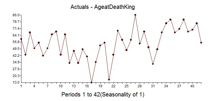
A fun dataset to explore is the "age of the death of kings of England".  The data comes form the 1977 book from McNeill called "Interactive Data Analysis" as is an example used by some to perform time series analysis.  We intend on showing you the right way and the wrong way(we have seen examples of this!). Here is the data so you can you can try this out yourself: 60,43,67,50,56,42,50,65,68,43,65,34,47,34,49,41,13,35,53,56,16,43,69,59,48,59,86,55,68,51,33,49,67,77,81,67,71,81,68,70,77,56

It begins at William the Conqueror from the year 1028 to present(excluding the current Queen Elizabeth II) and shows the ages at death for 42 kings.  It is an interesting example in that there is an underlying variable where life expectancy gets larger over time due to better health, eating, medicine, cyrogenic chambers???, etc and that is ignored in the "wrong way" example.  We have seen the wrong way example as they are not looking for deterministic approaches to modeling and forecasting. Box-Jenkins ignored deterministic aspects of modeling when they formulated the ARIMA modeling process in 1976.  The world has changed since then with research done by Tsay, Chatfield/Prothero (Box-Jenkins seasonal forecasting: Problems in a case study(with discussion)” J. Roy Statist soc., A, 136, 295-352), I. Chang, Fox that showed how important it is to consider deterministic options to achieve at a better model and forecast.

As for this dataset, there could be an argument that there would be no autocorrelation in the age between each king, but an argument could be made that heredity/genetics could have an autocorrelative impact or that if there were periods of stability or instability of the government would also matters. There could be an argument that there is an upper limit to how long we can live so there should be a cap on the maximum life span.

If you look at the dataset knew nothing about statistics, you might say that the first dozen obervations look stable and see that there is a trend up with some occasional real low values. If you ignored the outliers you might say there has been a change to a new higher mean, but that is when you ignore outliers and fall prey to Simpson's paradox or simply put "local vs global" inferences.

If you have some knowledge about time series analysis and were using your "rule book"on how to model, you might look at the ACF and PACF and say the series has no need for differencing and an AR1 model would suit it just fine.  We have seen examples on the web where these experts use their brain and see the need for differencing and an AR1 as they like the forecast.


You might (incorrectly), look at the Autocorrelation function and Partial Autocorrelation and see a spike at Lag 1 and conclude that there is autocorrelation at lag 1 and then should then include an AR1 component to the model.  Not shown here, but if you calculate the ACF on the first 10 observations the sign is negative and if you do the same on the last 32 observations they are positive supporting the "two trend" theory.

The PACF looks as follows:

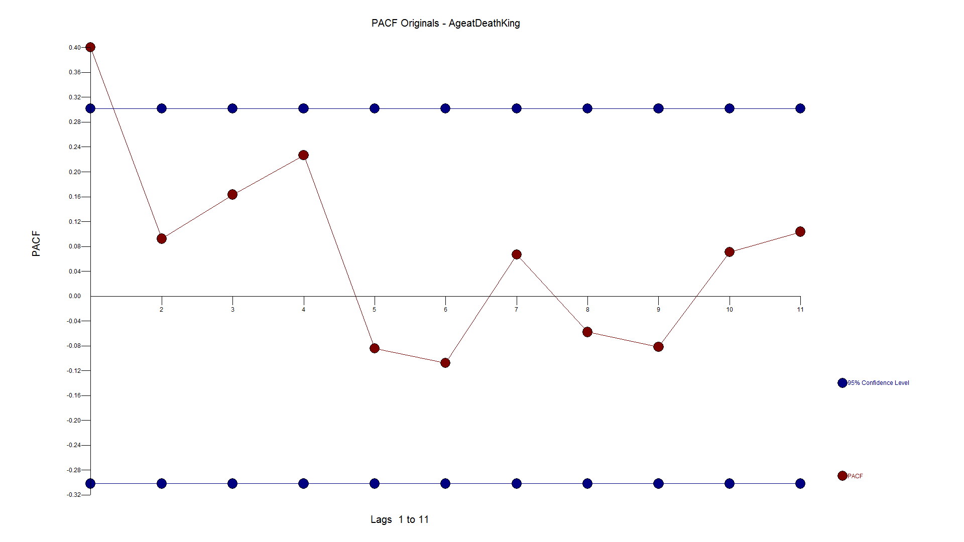
Here is the forecast when using differencing and an AR1 model.


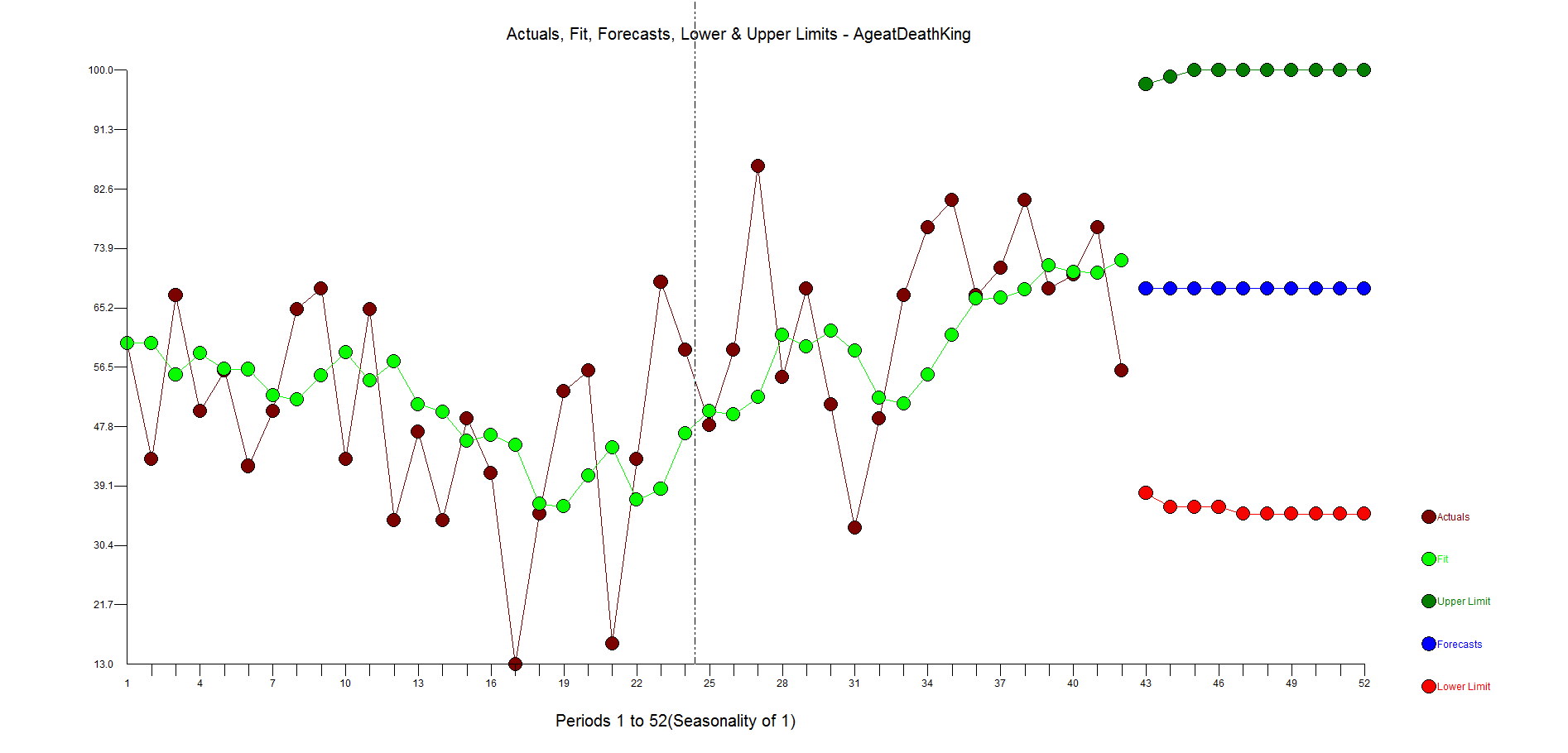
The ACF and PACF residuals look ok and here are the residuals.  This is where you start to see how the outliers have been ignored with big spikes at 11,17,23,27,31 with general underfitting with values in the high side in the second half of the data as the model is inadequate.  We want the residuals to be random around zero.


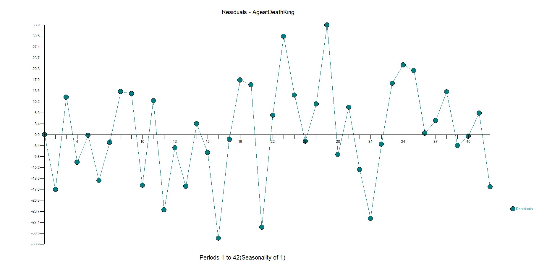
Now, to do it the right way....and with no human intervention whatsoever.

Autobox finds an AR1 to be significant and brings in a constant.  It then identifies to time trends and 4 outliers to be brought into the model. We all know what "step down" regression modeling is, but when you are adding variables to the model it is called "step up".  This is what is lacking in other forecasting software.


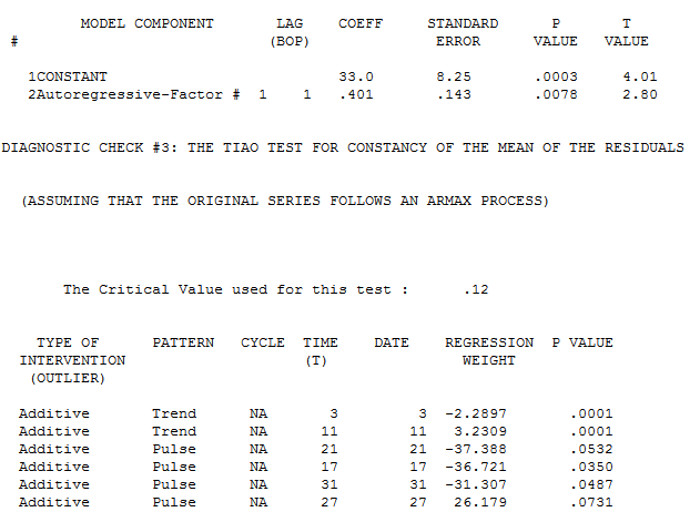
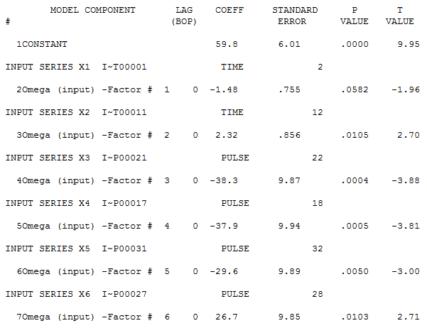
Note that the first trend is not significant at the 95% level.  Autobox uses a sliding scale based on the number of observations.  So, for large N .05 is the critical value, but this data set only has 42 observations so the critical value is adjusted.  When all of the variables are assembled in the model, the model looks like this:


If you consider deterministic variables like outliers, level shifts, time trends your model and forecast will look very different.  Do we expect people to live longer in a straight line?  No.  This is just a time series example showing you how to model data.  Is the current king (Queen Elizabeth II) 87 years old?  Yes.  Are people living longer?  Yes.  The trend variable is a surrogate for the general populations longer life expectancy.


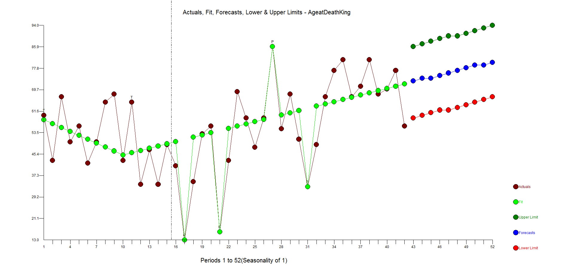
Here are the residuals. They are pretty random.  There is some underfitting in the middle part of the dataset, but the model is more robust and sensible than the flat forecast kicked out by the difference, AR1 model.

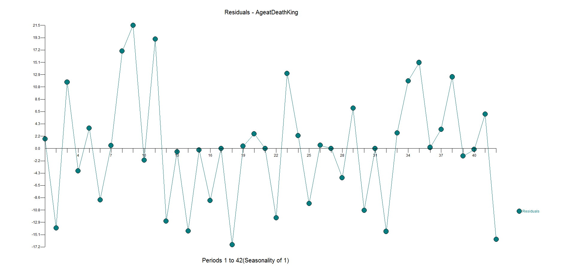
Here is the actual and cleansed history of outliers. Its when you correct for outliers that you can really see why Autobox is doing what it is doing. 
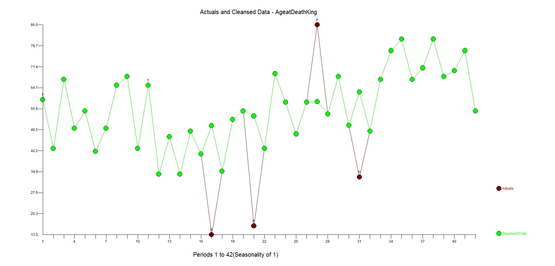


We're trying to make easier for you to prove that Autobox isn't what we think it is.  Post your model, fit and forecast and we'll post Autobox's output. Anyone, feel free to post any other 30 day trial links here as well that are "time series analysis" related.

RATS

http://www.estima.com/ratsdemo.shtml


Minitab

http://www.minitab.com/en-US/products/minitab/free-trial.aspx


Salford Systems - They say they have time series in the new version of SPM 7.0, but we can't find it so this won't do you any good. Click on the top right of the screen if you want to try your luck.

http://www.salford-systems.com/products/spm/whats-new


SYSTAT

http://www.systat.com/SystatProducts.aspx


XL Stat

http://www.xlstat.com/en/download.html


GMDH Shell - New to the market. Click on the bottom of the screen to download. They offer the International Airline Passenger Series as soon as you run it. If you run it, it makes no attempt to identify the outliers known to be the demise of any modeler plus it has a very high forecast which was ther subject of criticism of Box-Jenkins using LOGS and ignoring the outliers. See Chatfield and Prothero's criticsm in the paper "Box-Jenkins seasonal forecasting: Problems in a case-study"

http://www.gmdhshell.com/


Here is the Passenger Series (monthly data) 144 obs

112.00

118.00

132.00

129.00

121.00

135.00

148.00

148.00

136.00

119.00

104.00

118.00

115.00

126.00

141.00

135.00

125.00

149.00

170.00

170.00

158.00

133.00

114.00

140.00

145.00

150.00

178.00

163.00

172.00

178.00

199.00

199.00

184.00

162.00

146.00

166.00

171.00

180.00

193.00

181.00

183.00

218.00

230.00

242.00

209.00

191.00

172.00

194.00

196.00

196.00

236.00

235.00

229.00

243.00

264.00

272.00

237.00

211.00

180.00

201.00

204.00

188.00

235.00

227.00

234.00

264.00

302.00

293.00

259.00

229.00

203.00

229.00

242.00

233.00

267.00

269.00

270.00

315.00

364.00

347.00

312.00

274.00

237.00

278.00

284.00

277.00

317.00

313.00

318.00

374.00

413.00

405.00

355.00

306.00

271.00

306.00

315.00

301.00

356.00

348.00

355.00

422.00

465.00

467.00

404.00

347.00

305.00

336.00

340.00

318.00

362.00

348.00

363.00

435.00

491.00

505.00

404.00

359.00

310.00

337.00

360.00

342.00

406.00

396.00

420.00

472.00

548.00

559.00

463.00

407.00

362.00

405.00

417.00

391.00

419.00

461.00

472.00

535.00

622.00

606.00

508.00

461.00

390.00

432.00


Your Stat teacher told you a lot of things.  Mostly wrong.  The way Intro stat classes go is that they start with the wrong things and slowly as you evolve up the level to a PHD they finally start telling you how to do it right.  It starts off with decomposing a series into Seasonality, Trend, Levels.  They dabble in this and that(ie exponential smoothing, trend, trend squared, logs).  Then they break out the surprise a few years into the Stat degree process and tell you that the errors need to be N.I.I.D.  Hold on.  So, everything you taught me about exponential smoothing and Holt-Winters violated the gaussian assumptions?  How about your current software?  Does it verify that the model or does it just fit a model from a list? I want my money back.   I will refer you the Meat Loaf song to pick your spirits up here.

Every good statistician will tell you that you should plot your data.  That might work fine when you have a couple of series, but no so when you have thousands.  It might not work so well even when you have just a few.  The reality is that it would take a very very strong analyst to tease out a model that detects the usual from the unusual or "signal and noise" that exists in data.

The process of identifying model that works can take you down many many paths often ending in a dead end.  So, the process is iterative and long.  Statisticians can spend a lot of time to do this and still end up with a half-successful model/forecast. There might be a level shift in the data due to legislation, competition, etc that may exist in the data that you might not even realize or two?  Where does this level shift exist??  How to find it?  In a word: An algorithm that iterates.  An algorithm that tries a bifurcates the data to identify these level shifts.  Or two. Or three.

We open up text books(yes even newly published ones) that disappoint, websites, posts on the blogs/discussion groups and see very simple approaches being brought to try and solve very nuanced data problems. I spoke someone at a Conference who had been out of the forecasting world for a bit and came back and said that she felt that things hadn't become more simple and not for the better.  The 80/20 rule doesn't apply here.  You can do better than an "B".  You can get an "A" on your report card with a little more effort.

We see software that even rigs the game so that the model/forecast seems better as it says it fit the last withheld observations well.  What happens when there is a level shift or an outlier in that withheld period?  Well then you have a model that predicts outliers well.

See more about how little lies your teacher told you like taking LOGS and tricks get you into trouble here


Go to top