|
|  |
|---|
|
| |
|---|
| This next discussion is a critique of standard techniques for forecasting and some suggestions. Presented by David P. Reilly, Senior Vice-President of Automatic Forecasting Systems. |  |
|---|
| We study history in order to assess relationships between economic variables. Care has to be taken regarding the assumptions underlying the model. If the statistical assumptions can not be validated then problems might arise. |  |
|---|
| Early training in statistics emphasized the analysis of cross-sectional data , i.e. non time-series data. If one is analyzing chronological data, using an inppropriate method can become a liability in model formulation. |  |
|---|
| Regression .... Opportunities and Pitfalls | |
|---|
| Detecting and Accounting for Variance Changes via Generalized Least Squares. AUTOBOX has built-in options to detect and to incorporate significant variance changes into the model. This leads to improved estimation of model coefficients and resultant identification of model form. | 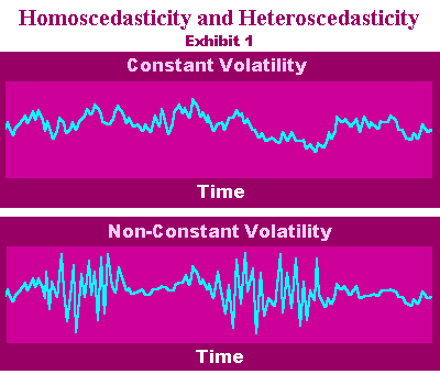 |
|---|
| A side bar on "data cleansing" . | |
|---|
| A side bar on "What to look for in a Forecasting Package" | |
|---|
| First some words and images on the role of forecasting in the decision process. |  |
|---|
| A side bar on "the role of forecasting in inventory control" . | |
|---|
| Planning , Forecasting and Reality |  |
|---|
| Typical and broadly incorrect or misleading representation of the "FAMILY TREE" . |  |
|---|
| A better representation of the "FAMILY TREE" |  |
|---|
| It is important to compare these two approaches as it summarizes the goals and various objectives. | 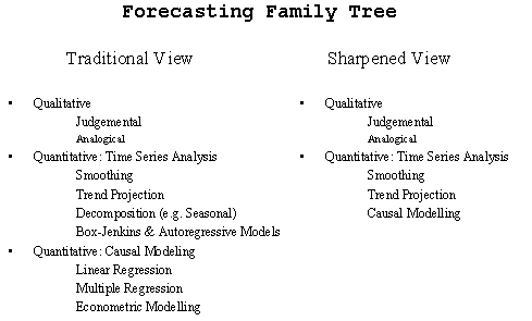 |
|---|
| Sharpening the focus. | 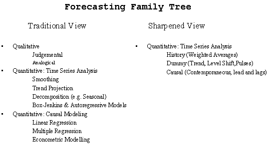 |
|---|
| A structural approach to the "FAMILY TREE". The role of the three (3) kinds of model components. 1 SMOOTHING ( MEMORY ) 2 TREND PROJECTION ( DUMMY ) 3 CAUSAL | |
|---|
| A structural approach to the "FAMILY TREE" with examples. | |
|---|
| Incorporating the effects of omitted and/or unknown variables into the model. | |
|---|
| A side bar on "Lies , Damn Lies & Statistics" . In 1933 M.S. Bartlett wrote a paper in the JRSS entitled "Why do we sometimes get nonsense correlations with time series" | |
|---|
| A side bar on "Hypothesis Generation". | |
|---|
| This data will be used to illustrate how forecasting with Linear Regression works. It shows how gas demand levels (target or DEPENDENT variable) varied with the price of the gas (INDEPENDENT variable) for a series of gas utilities in a large country. The data relates to what an economist would call the Price/Demand relationship. We will approach the problem using simple tools and then use more comprehensive techniques to ensure that the statistical assumptions are met. |  |
|---|
|
The first step is to plot the Independent (also called Predictor) variable
as x (horizontal axis) against the Dependent (also called Predicted) variable
as y (vertical axis). Always use this convention. Examination of the SCATTERPLOT
suggests a curved relationship. So, a straight line may be too simple a
model to extract all the relationship information in the data. Nevertheless,
it is useful to see how well a straight line as a model of the Price Demand
relationship would work in this case, and how evaluation of the model can
bring out the difficulties. |  |
|---|
| If you control for time a totally different message is perceived. There is no relationship what so ever between these two variables. | 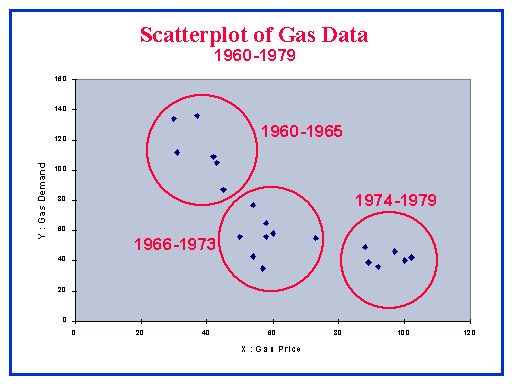 |
|---|
|
Before we get too ahead of ourselves let us pursue the simple and simply
incorrect approach that leads to flawed conclusions. We go down this path
to illustrate what is normally done and why it is often inappropriate.
This briefing indicates the interpretation of the different elements of the Linear Regression line. In a slightly different form this information was used in the previous unit of work when fitting a straight line. |  |
|---|
| A side bar on exactly what the assumptions are of a regression model. | |
|---|
|
So, we fit a straight line to the data shown in the scatterplot. You
could use a ruler, but this doesn't identify the "best fit" line.
The simplest statistical way is to use line fitting or regression features
in your spreadsheet, statistical or graphics package. Many of these provide
a way of finding the line and the line equation, together with R squared
(the Coefficient of Determination). These are shown. | 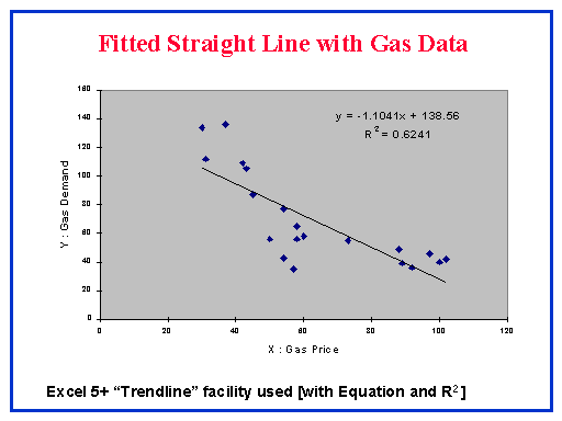 |
|---|
|
Logs don't help ( in this case ). A logarithmic transformation is sometimes necessary
to make the variance of the errors homogenous or constant. If the original
data exhibits a correlation between the level of the series and the
standard deviation then one should "uncouple" this relationship by
taking logs. Similarly if the level and the variance is correlated then
a square root transformation might be in order. There can also be cases
where the variance changes at specific points in time totally independent
of the level of the series. This is referred to as "regime changes".
|  |
|---|
|
The scatterplot (also called scattergram) suggested earlier that the relationship isn't linear (a straight line), but curves somewhat. We have embarked on using a straight line as a "first try" model! But other steps are useful to check linearity since much of the statistical validity of forecasting will rest on this assumption of linearity. The main technique to use is Residual Analysis. A simple form of this is to chart Residuals against the Predicted values of the Dependent variable (y). Software normally (optionally) generates this (or the data to plot it). |  |
|---|
|
Residuals from a model can reflect omitted structure. The purpose of residual diagnostic checking is to identify the nature and the form of model augmentation suggested by these residuals. Model augmentation can include ARIMA or memory components , additional lags for an input series or the incorporation of dummy (0/1) variables to reflect pulses, seasonal pulses, level shifts or local time trends. |  |
|---|
|
Another view. |  |
|---|
|
The idea that the expected range for these residuals can be computed using the "standard deviation" requires the strong assumption of independence in the error term. For example if the residuals appeared as 1,-1,1,-1,...1,-1 the standard deviation would be overstated. The range is equal to 6 times the standard deviation when the process is N.I.I.D. i.e NORMAL. |  |
|---|
|
Sometimes things that you get for nothing have a cost. Free forecasting or modelling tools in the spreadsheets are extremely dangerous and should be used with caution. | 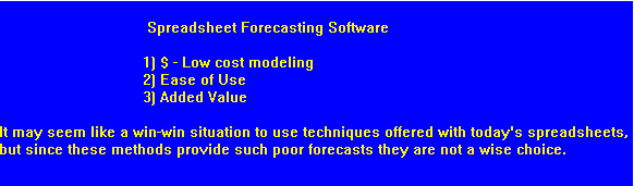 |
|---|
| Diagnostic and Remedial Tools (THEORY) | |
|---|
| Diagnostic and Remedial Tools (PRACTICE) | |
|---|
| An intro to ARIMA model identification. | |
|---|
| Forecasting Weekly Beer Sales | |
|---|
| A side bar on a modest problem ... from Her Majesties Government | |
|---|
| More on the modest problem. | |
|---|