WHAT'S HAPPENING ?
CONVERTING DATA TO HYPOTHESIS
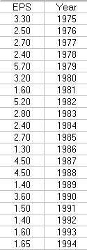
| It is quite natural to compute statistics summarizing an activity variable.
For example, let's examine a specific time interval like Earnings Per Share (EPS) for
the most recent 20 years. When analyzing the most recent reading, questions
naturally arise regarding the import and the conclusions that should
be drawn. Descriptive statistics such as % change from the previous year
or whether the value is above/below a 5 period moving average don't do
justice to the data.
It is in this light that we introduce the concept of What's Happening
and suggest a significant improvement in the decision making process.
The auditor in the Analytical Review Process faces the same question,
"What's Happening ?"
|  |
|---|
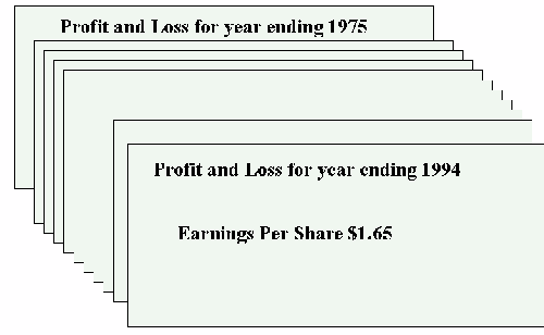
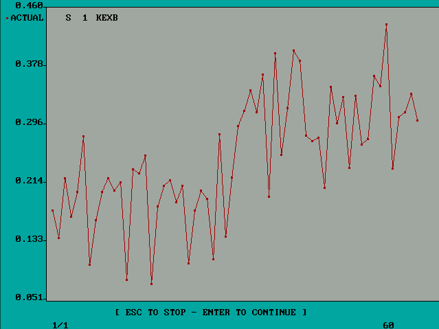
| The basic data is Earnings Per Share for the time period 1975
through 1994, a 20 year period. The most recent observation is
$1.65 and the natural question is "What does this mean or suggest
that I do ?"
|  |
|---|
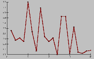
| Looking at a graph of the these numbers our eye
is lead in a downward projection and the natural, if not flawed, conclusion
is that pessimism abounds and things are projected to be further
downward.
However, upon a more detailed look one notices that the last four values
1991 $ 1.50
1992 $ 1.40
1993 $ 1.60
1994 $ 1.65
tell a different story.
|  |
|---|
| The plot of the 20 values.
|  |
|---|
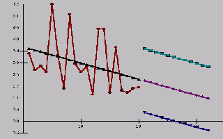
| It is quite natural to assume a linear trend model and to get
the following.
|  |
|---|
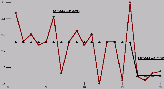
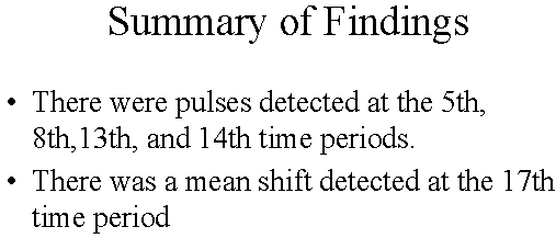
| Careful analysis detects some unusually high values and a
regime shift or paradigm change pointing to the year 1991 as the
start of another trend. There should be a follow up question as
to what may or may not have happened on or about 1991 to cause this
phenomenon.
|  |
|---|
| The statistical analysis tells us that there was a statistically
significant difference in two means found at 1991. The mean or
average for the first 16 years, after adjusting for outliers, was
$2.486 versus $1.532 for the last four years. A differential of $.954 .
If we adjust the last 4 years for this assignable cause, we get a plot
of what "should have been".
|  |
|---|
| Another view or take on this is to present the outlier adjusted series
and the regime shift is even more pronounced.
|  |
|---|
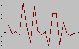
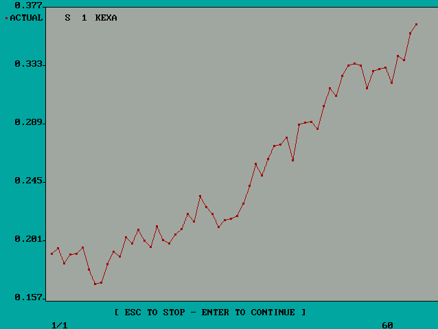
| Consider the following example. Is this a trending series?
How would you characterize it? How would you forecast it?
|  |
|---|
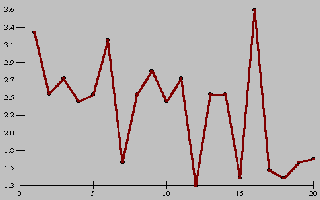
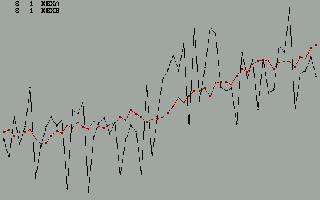
| Now consider another example. Is this a trending series?
How would you characterize it? How would you forecast it?
|  |
|---|
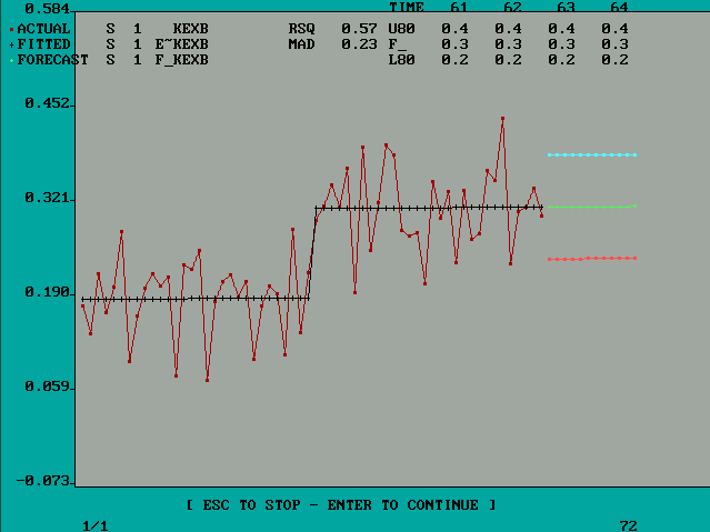
| If you answered positive, i.e. both series are upward trending
you might now consider them in relief. The first series is now exposed
to be not upward trending while the second is confirmed as such.
|  |
|---|
| The policy implications or conclusions are dramatically different
as you can see from this figure.
|  |
|---|
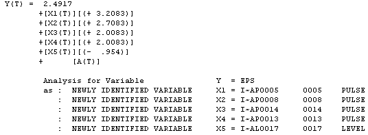
| The equation that was found to describe or synthesize the
series is shown here. Note the detection of four unusual values and
the level shift occurring on or about time period 17 (1991). The
magnitude of the level shift is estimated to be $ .954 .
|  |
|---|
| A plot of the outlier adjusted series showing the two distinctly
different local means provides support to the conclusions that
the series is not downward trending and the best forecast is simply
the mean of the last four values ... $ 1.532.
|  |
|---|
| The hypothesis generated or conclusions that should be drawn
are summarized here.
|  |
|---|
CLICK HERE:Home Page For AUTOBOX