DESCRIPTIVE STATISTICS FAIL TO FULLY UTILIZE THE INFORMATION AVAILABLE FROM DATA.
*******
EXAMPLES OF DATA LEADING TO CONCLUSIONS AND ACTIONABLE ITEMS
via MODERN TIME SERIES ANALYSIS.
|
We now present six different examples of time series analysis which culminate
in direct statements about the impact or meaning of recent data. The first example
illustrates a contrast where the most recent value is very close to
the average value, but still unusual. The second case points to a detection of
a mean shift. The third and fourth cases deal with detecting and reporting a
change of trend. While the fifth case illustrates the value of supporting
variables in identifying exceptions and the sixth case is a counter example of
the value of causal variables.
|  |
|---|
|
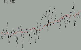
When is the expected value equal to the mean ? When is the mean an unusual value ?
These are the questions that can be dealt with when one is armed with
modern time series analysis. Exception detection or early warning systems
sometimes incorrectly employ % change or some constant differential as
the methodology to flag unusual activity. This example illustrates what
the eye immediately detects. AUTOBOX performs just like your eye.
|  |
|---|
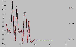
| When describing a set of numbers one often uses the mean. However, if the
mean has shifted then it is important to footnote. Here, we can say that the
mean of the first 16 values is significantly different from the mean of
the last four values. Strong statements lead to action oriented decisions.
Some analysts might incorrectly project this down.
|  |
|---|
| When you impose or specify a model form either directly or from a subset
the answer you get is often based upon your specification.
|  |
|---|
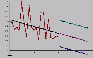
| Take another look at these 20 values. Notice that once your focus is
directed to the correct contrast, i.e. the first 16 versus the last 4,
your eye confirms the conclusion. The problem is that some unusual values
in the past have a tendency to confuse not only the eye, but some statistical
analysis.
|  |
|---|
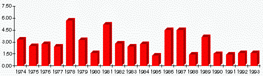
| The issue is that aside from 1978, 1981, 1986 and 1987, four unusually high values
there is no downward trend. Some would argue that there have been
values as low as the last four during previous years (1980,1985,1988) thus these four values do not represent
unusual activity. Collectively they do ! The probability of four values as consistently as low as these is near zero.
| |
|---|
| Some attempts have been made to allow graphical interfaces to detect
anomalies and significant events. They fail because of their inability to
collectively analyze.
| |
|---|
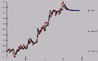
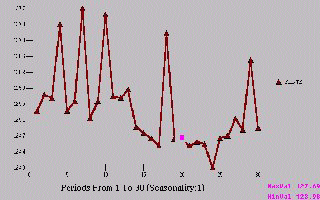
| "A trend is a trend until it bends" is an old proverb. Time series
methods can discern when the rate of growth has changed and a plateau has
been approached. This plot illustrates the power of model identification
leading to a conclusion that is again visible.
|  |
|---|
| Some time series are easy to model, others represent a challenge.
Make sure that the tools you bring to bear on a problem are industrial strength
and employ the best pattern recognition techniques as good if not better than your eye.
These are two kinds of series. One has a level shift, the other has a trend.
It is crucial to be able to distinguish between these two phenomena.
|  |
|---|
| Consider the following graph. Select the point that is unusual. One
has to make that assessment given a body of existing knowledge. If
you are told nothing but the information in this graph, you would conclude
that there are five unusual points with unexpected high sales.
|  |
|---|
| If we now show that graph again but with the unusal value denoted, you
might be somewhat skeptical as it would appear to be very normal or typical.
|  |
|---|
| The reason that that one point was highlighted was due to the fact
that a promotion had been put on at six points in time, but that point was
the only period that sales did not respond to the stimulus. You might call
it an "inlier".
|  |
|---|
| Showing both the sales series and the promotion series we can clearly
see the exceptional activity of non-response.
|  |
|---|
| The key point is when estimating the impact of the promotion, one might
wish to robustly compute the beta using 5 incidences rather than 6. Clearly,
there must be an assignable cause to the one time period of non-response.
| |
|---|
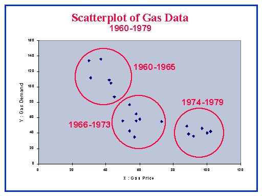
| Current practice is to use, or is it misuse spreadsheet or
statistical tools without regard for the underlying assumptions.
Consider an example where demand for gas is related to the price for
a 20 year period. A model is developed and would appear to be
fairly reasonable.
|  |
|---|
| Some practictioners in an attempt to deal with the apparent
non-randomness of the errors fit complicated models involving unwarranted
transformations.
|  |
|---|
| Upon closer, a lot closer, inspection we find that there are
assignable causes other than the price variable. We find that price
is not a factor with no clear correlative
structure. The conclusion is that policy or some exogenous variable is
important and that the correlation between demand and price may be spurious.
|  |
|---|
| A structural approach to the "FAMILY TREE". The role of the three (3) kinds of model components.
1 SMOOTHING ( MEMORY )
2 TREND PROJECTION ( DUMMY )
3 CAUSAL
|  |
|---|
| An organized model selection menu.
| |
|---|