The ecological fallacy is an example of the effect of spurious correlation. It is called "ecological" not because it has anything to do with ecology or the environment but because it has to do with analyzing data areas or groups or aggregates. Typically, what happens is that aggregates of data (like counties) will show some relationship between the average value of one variable and the average value of another; however, at the same time, the relationship between the individual values of those variables may be quite different.
Here is a hypothetical example. Suppose we had a survey of ethnic restaurants in the Bay Area that scored them on quality of their food. Suppose we analyzed the relationship between quality of food in ethnic restaurants and the level of personal income by zip code. It is not unreasonable to expect that the better ethnic restaurants will be in low income areas; for example, it is not easy to buy soul food in Piedmont or Atherton. This means that the data would show a negative association between income and quality of food.
On the other hand, it is not unreasonable to expect that customers with higher incomes will pay more for better ethnic food. So, if you looked at this information at the level of the individual customer and the individual restaurant, you would see that there was a positive association between level of income and quality of food, even if people only eat out in their own zip code area.
Here is a hypothetical example of the data at the level of individual
restaurants, each with a food score, a zip code location, and the
average income of the customers who eat in that restaurant.
| Zip code | Food Score | Income |
| 99991 | 20 | 48 |
| 99991 | 21 | 49 |
| 99991 | 22 | 50 |
| 99991 | 23 | 51 |
| 99991 | 24 | 52 |
| 99992 | 25 | 43 |
| 99992 | 26 | 44 |
| 99992 | 27 | 45 |
| 99992 | 28 | 46 |
| 99992 | 29 | 47 |
| 99993 | 30 | 38 |
| 99993 | 31 | 39 |
| 99993 | 32 | 40 |
| 99993 | 33 | 41 |
| 99993 | 34 | 42 |
| 99994 | 35 | 33 |
| 99994 | 36 | 34 |
| 99994 | 37 | 35 |
| 99994 | 38 | 36 |
| 99994 | 39 | 37 |
| 99995 | 40 | 28 |
| 99995 | 41 | 29 |
| 99995 | 42 | 30 |
| 99995 | 43 | 31 |
| 99995 | 44 | 32 |
| 99996 | 45 | 23 |
| 99996 | 46 | 24 |
| 99996 | 47 | 25 |
| 99996 | 48 | 26 |
| 99996 | 49 | 27 |
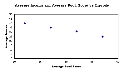
If this information were available in a typical census it would look like this:
| Zip code | Mean Food Score | Mean Income |
| 99991 | 22 | 50 |
| 99992 | 27 | 45 |
| 99993 | 32 | 40 |
| 99994 | 37 | 35 |
| 99995 | 42 | 31 |
| 99996 | 47 | 25 |
If you did a graph of the information at the zip code level you
would see this
The higher income the worse the food.
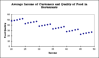
On the other hand if you did a graph of the information at the
level of the individual restaurant you would see this:
And it is clear from this picture that food quality and customer
income rise together, that this same relationship persists across
zip codes, and the decline across zip code areas is just a function
of the difference between them as aggregates.
It would be false to claim that people spend more money for worse food. They spend more money for better food, but it depends on where they eat.